
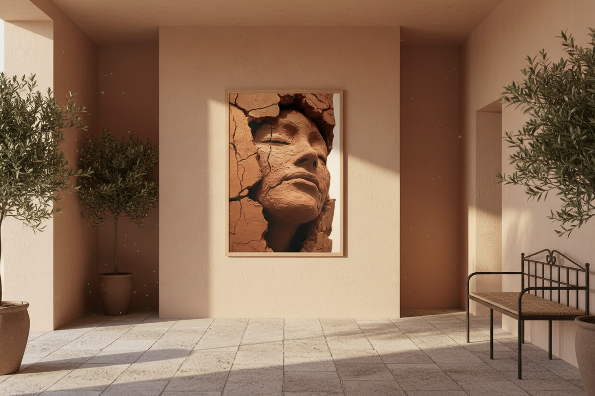
Terracotta hallway: how to dress a hallway in burnt-earth tones
The hallway is the room you walk through without ever looking at it. Narrow, often windowless, lit from the ceiling: it is the least rewarding space in the house, and the one where a well-chosen colour changes everything. Terracotta works better here than anywhere else — provided you understand why, and know where to stop.
Why terracotta holds up in a hallway
A hallway almost never has daylight. Cool whites and greys turn dull there, because they have nothing to reflect: all they return is artificial light, which is yellow. Terracotta already contains that warmth. Under a bulb it doesn't distort — it lights up. That is the simple reason a terracotta hallway feels welcoming where a white one feels empty.
A second, less obvious reason: terracotta is a colour that advances. It visually pulls forward the wall it sits on. In a large room that's a flaw to manage. In a hallway it's a tool: on the end wall it shortens the perspective and turns a tunnel into a room in its own right.
Terracotta and wood: the pairing that gives structure
If the hallway has wooden doors, half the work is already done. Terracotta and light wood — oak, beech, pine — share the same warm base, which avoids any break. The wood supplies the vertical line, the terracotta the mass. The whole thing stands up visually without anything else being added.
With dark wood, walnut or stained, the rule changes: the terracotta needs lightening. A powdery clay tone rather than a saturated burnt earth, or the whole thing darkens and the hallway closes in.

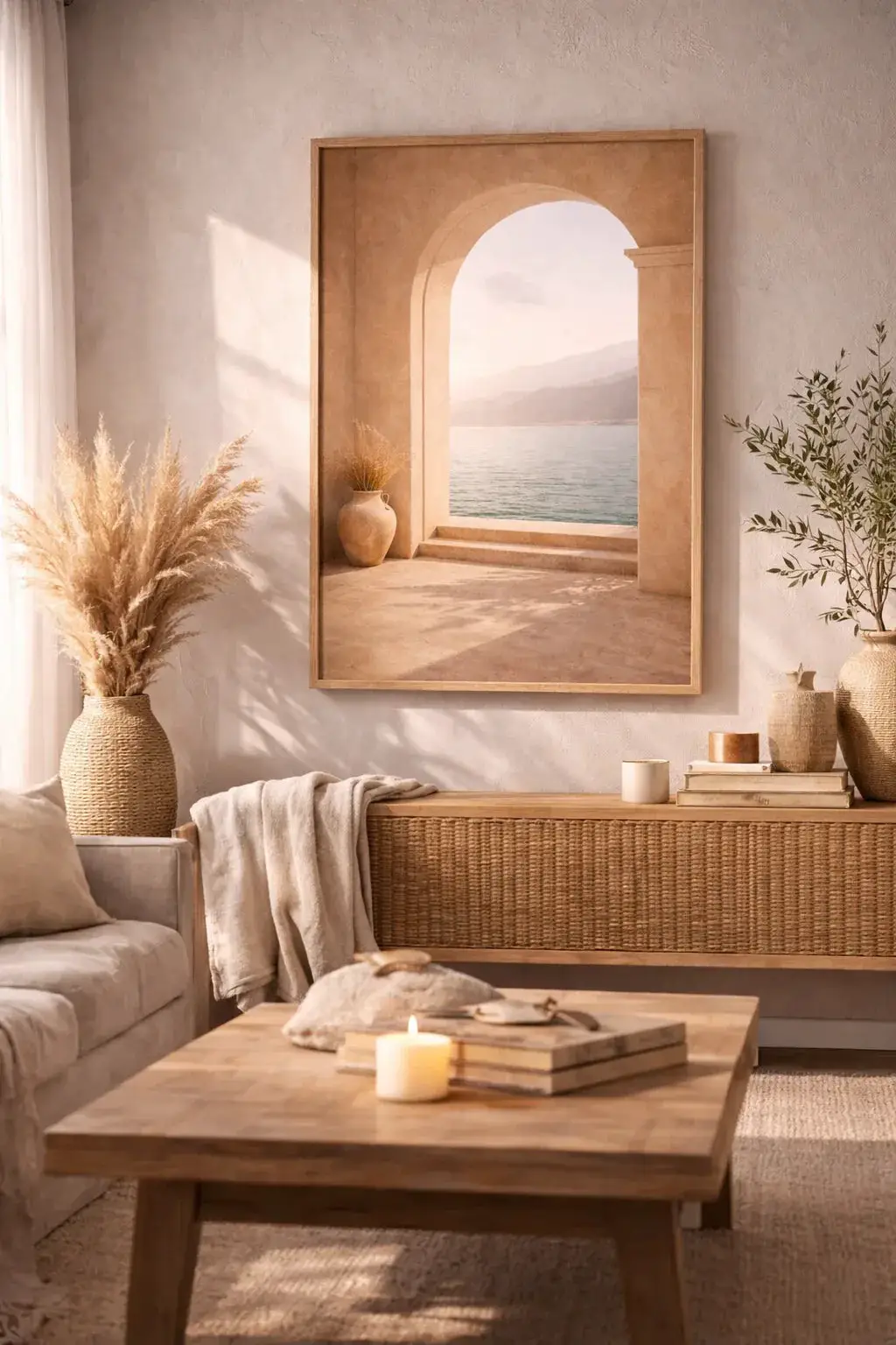
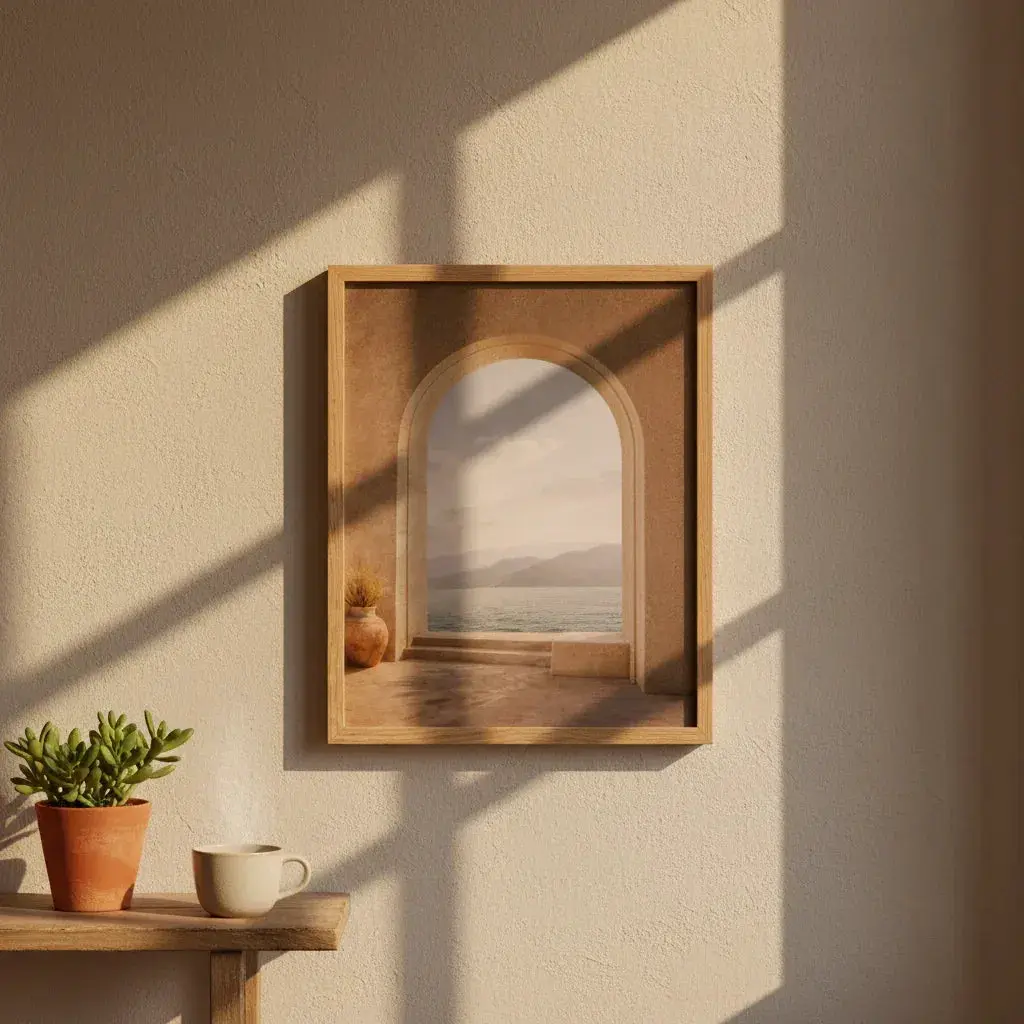
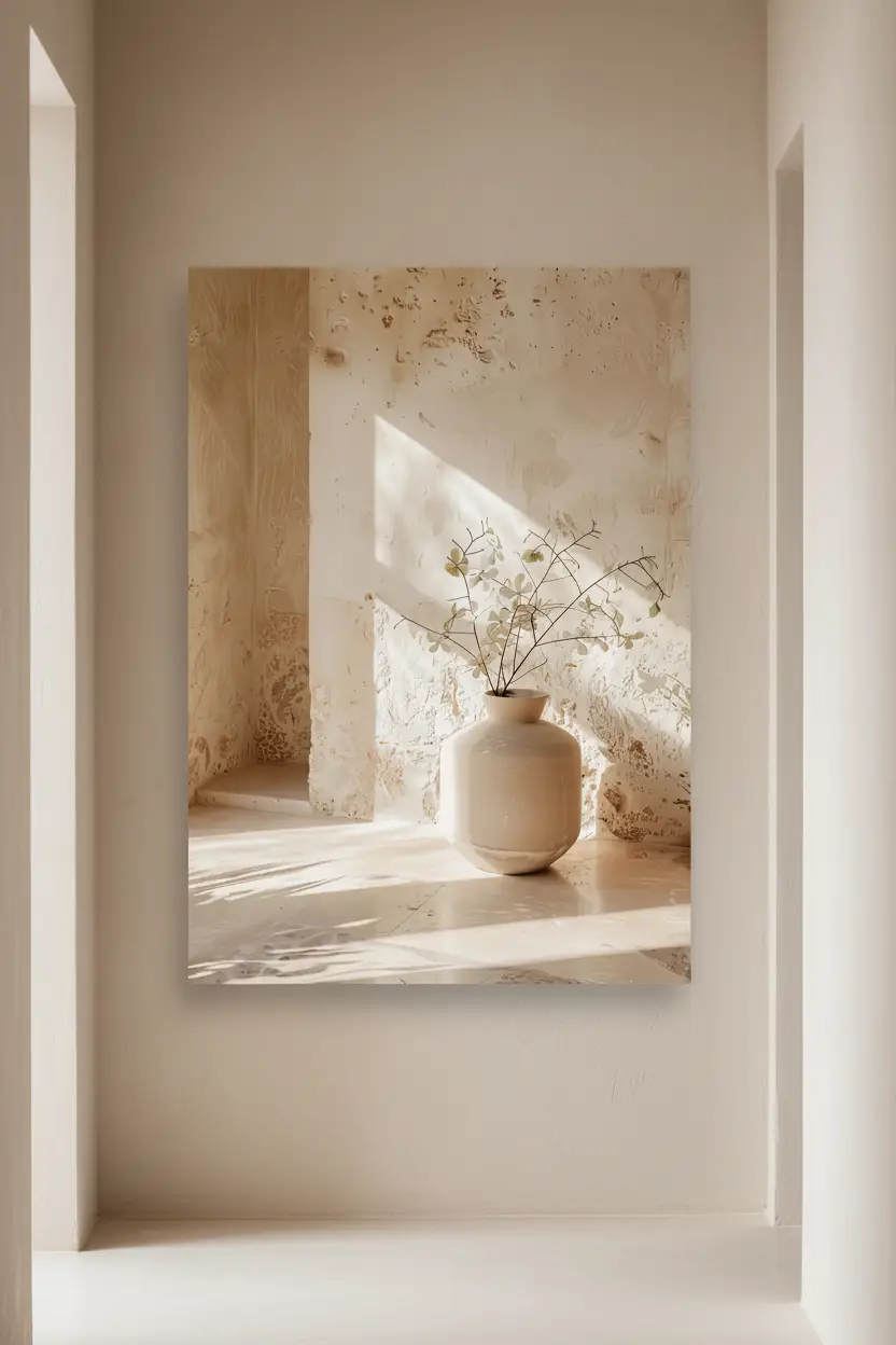
The Hallway — from 39 €
Hallway with no light: dose it rather than give up
The classic fear is that a warm colour will darken an already dark space. That's true if you paint all four walls. Three approaches work better:
The end wall only, the rest in off-white or sand. It's the safest option: the colour gives the eye somewhere to arrive, and the hallway stops being a passage.
A dado, terracotta up to handle height, light above. The wall looks taller, and fingerprints and suitcase marks disappear into the darker tone.
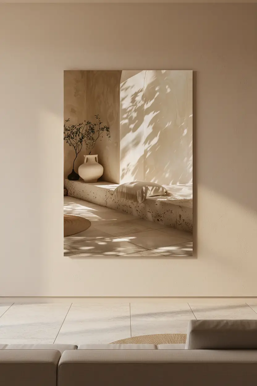
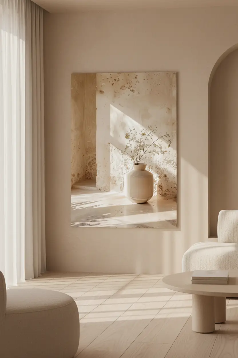
And the most reversible option: no paint at all, terracotta introduced only through what goes on the wall. A print in clay tones on a light wall brings the same warmth with zero commitment.

The Terracotta Passage — from 39 €
Narrow hallway: play the proportions
In a hallway under four feet wide, a single large print works better than a series of small formats. The eye reads one object instead of counting five, and the wall looks less crowded. Portrait format emphasises height; landscape, hung low, widens.
A composition in a line — three prints of the same format, aligned on their horizontal axis — lengthens the hallway instead of narrowing it, because it gives the eye a direction. The opposite of a disorderly gallery wall, which chops the space up.
A detail almost everyone misses: in a hallway you don't step back. You see the prints at an angle, from fifty centimetres. Images with fine patterns or text read badly in those conditions. Compositions with broad shapes — arches, flat colour, silhouettes — survive the glancing view.

The Eye of the Desert — from 39 €
The colours that go with it
Sand and off-white remain the safest partners: they let terracotta breathe without cooling it. Sage green works very well in small doses — a plant, a frame — because it brings the plant-like freshness a closed space lacks. Deep blue belongs in wide hallways: in a narrow space the contrast turns harsh.
To avoid: cool greys and bluish whites, which tip terracotta towards brick red. And clutter — a hallway is walked through, it doesn't need to tell five stories.
Cassili-home
Two prints made for a terracotta hallway
 The HallwayMatte paper · from 39 €View the print →
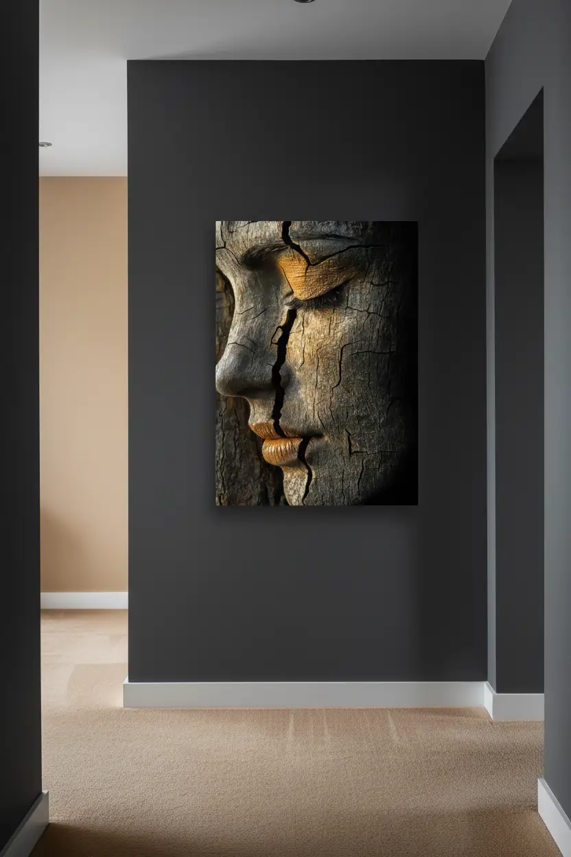
 Soul of EarthMatte paper · from 39 €View the print →
Printed to order, delivered ready to hang within 7 to 10 days.
Mistakes to avoid
Painting the whole hallway in saturated terracotta: the space closes in and the passage becomes oppressive. Hanging prints too high: in a hallway you walk, the eye is at eye level, not above it. Multiplying small formats on a narrow wall. And lighting a warm wall with cold fluorescent light — the surest way to make the colour tip.
In short
Terracotta is one of the few colours that tolerates the absence of daylight. In a hallway it goes on the end wall or as a dado, it sits naturally with light wood, and it can be introduced with no paint at all through what goes on the wall. The rest is a question of proportions. To put a palette together, explore our terracotta print collection and our sand and beige prints. To go further on pairings: what colour goes with terracotta.
Discover our terracotta prints →
FAQ — Terracotta hallway
Does terracotta darken a windowless hallway?
Not if it sits on a single wall or as a dado. Unlike greys and cool whites, it holds a warmth that reveals itself under artificial light. What darkens a hallway is painting all four walls in a saturated tone, whichever one it is.
What colour goes with terracotta in a hallway?
Sand, off-white and linen as the dominant; sage green in touches; light wood for doors and frames. Avoid cool greys and bluish whites, which tip terracotta towards brick red.
What print size for a narrow hallway?
One large format rather than several small ones. Portrait emphasises height, landscape widens. If you want a series, align three identical formats on the same horizontal axis: the line lengthens the hallway.
Paint, or simply decorate?
Decorate first. A print in clay tones on a light wall gives the same warmth as a painted wall, with no commitment and at an incomparable cost. It is also the most honest way to test the colour before reaching for the roller.


Leave a comment
This site is protected by hCaptcha and the hCaptcha Privacy Policy and Terms of Service apply.