
Choosing three posters that work together: the method
Reading time: 7 min
You rarely buy a poster. You buy a wall. That is what is at stake the moment you hesitate between two or three images in a basket: it is not which one is the most beautiful, it is which one will hold next to the others. A stunning poster can weaken the two around it, and a quiet poster can hold the whole set together.
Most advice explains how to hang a composition — spacing, height, a kraft paper template. Almost none explains how to choose it. Yet that is where everything is decided.
Why three, and not two or five
Two posters invite comparison. The eye looks for symmetry and notices the slightest imbalance: a frame hung higher, a lighter background, a busier subject. Two images demand perfect equality, which is hard to hold.
Five posters become a gallery wall: alignments, gaps, breathing room — a composition exercise in its own right.
Three is the first number that allows a hierarchy. One image carries, two accompany. The eye no longer compares, it travels. It is also the arrangement that fits the width of a standard sofa or a sideboard, without spilling over or looking timid.
The rule that decides everything: one dominant, two companions
This is the only truly structuring rule, and it is settled before the color, before the size, before the frame.
- The dominant — the image that carries the subject, the one you look at as you walk in. The strongest contrast, or the most legible motif.
- The companions — two calmer images, more textured, less narrative. They tell no story, they set a material.
A failed trio is almost always a trio of three dominants: they compete for the eye, and the wall becomes noisy without anyone being able to say why. Three calm images, conversely, give an elegant but lifeless whole.

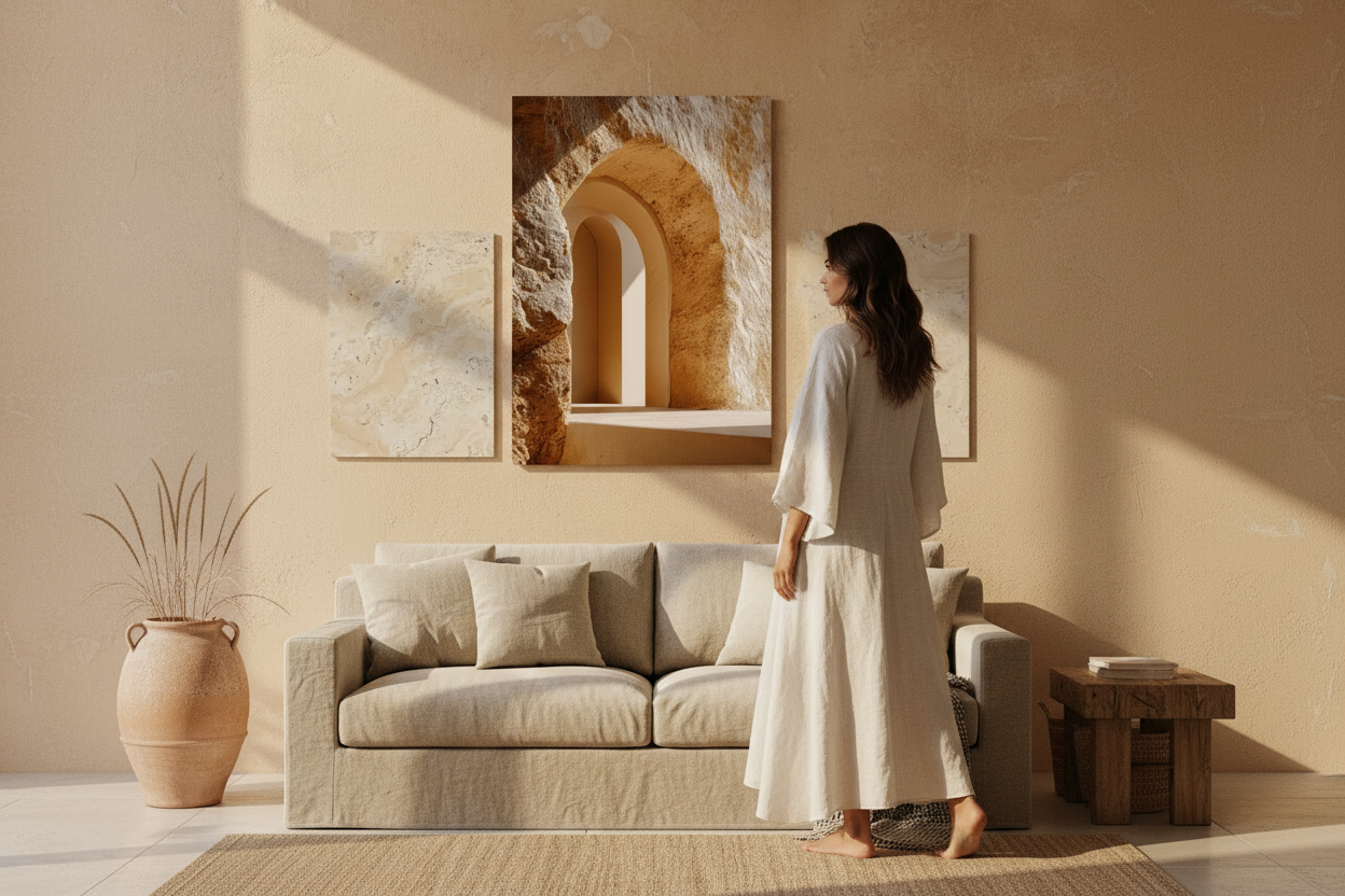
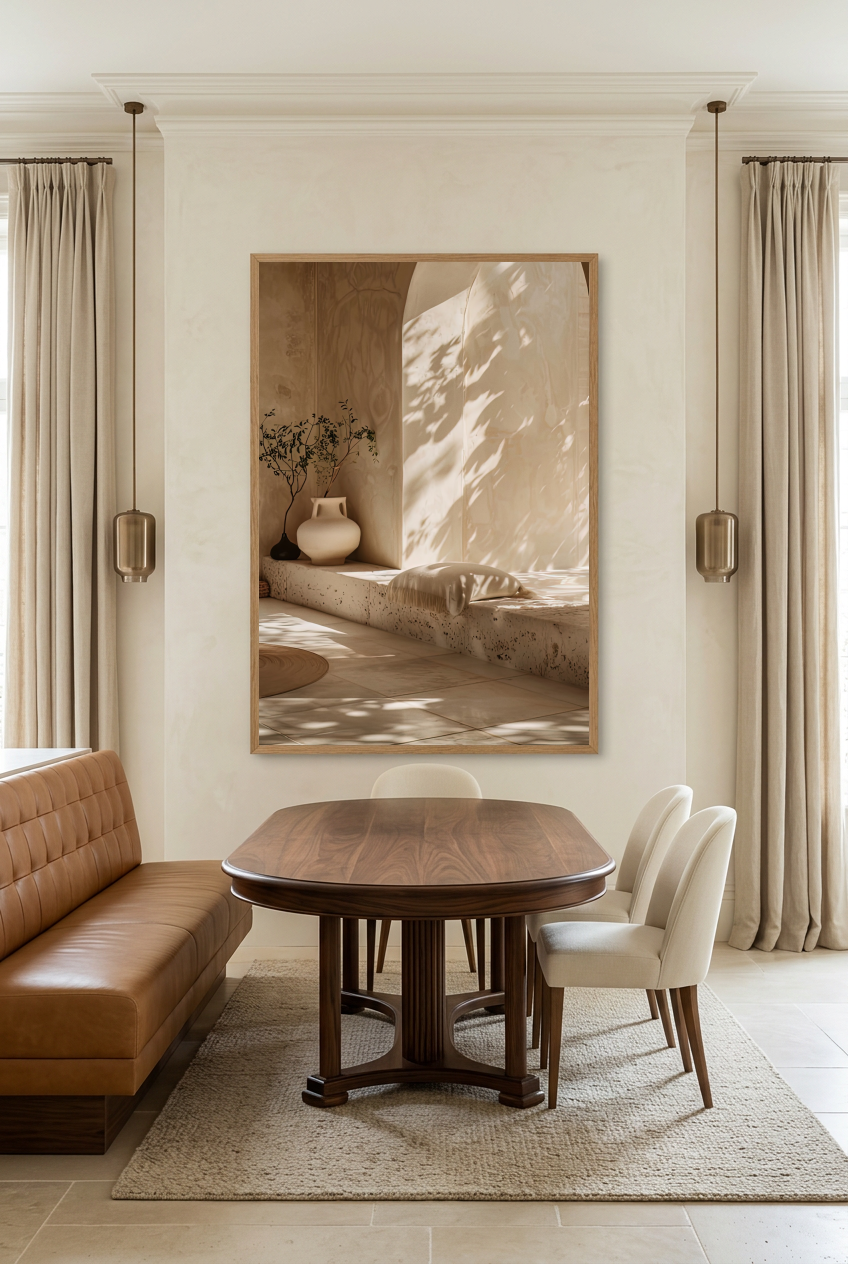
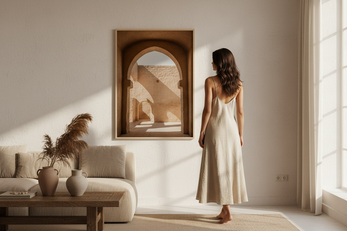
The Sandstone Arch — the dominant of a trio: legible architecture, surrounded by two quieter materials.
The common thread: what must be shared, what must differ
A trio holds when one thing is shared and another varies. If everything is shared, the set is flat. If everything differs, it falls apart.
- Share the palette — this is the strongest and most forgiving thread. Three images in the same family of beiges, ochres or terracotta will hold together even if the subjects have nothing in common.
- Share the light — a raking light next to a frontal light shows. Look at where the shadow falls on each image: it must come from the same side.
- Vary the scale of the motif — a wide shot, a medium shot, a macro. This is what stops the set from looking like three versions of the same poster.
- Vary the density — one busy image, two images with empty space. Empty space is not waste, it is what lets the dominant breathe.
The most reliable shortcut: choose the dominant first, then take the other two from the same collection. Our Architecture collection, Minéral collection and Végétal collection are built on coherent palettes — two posters from the same family almost always agree.
Three combinations that work
These are not rules, they are starting points that avoid dead ends.
- Architecture + material + material — an arch or a vault as the dominant, two mineral textures around it. This is the safest combination for a beige and wood living room.
- Object + botanical + texture — a vase or a still life as the dominant, a branch, a stone. It works well above a sideboard or in a dining room.
- Silhouette + two abstracts — a face or a body as the dominant, two worked backgrounds. More assertive, best kept for rooms where you spend time.

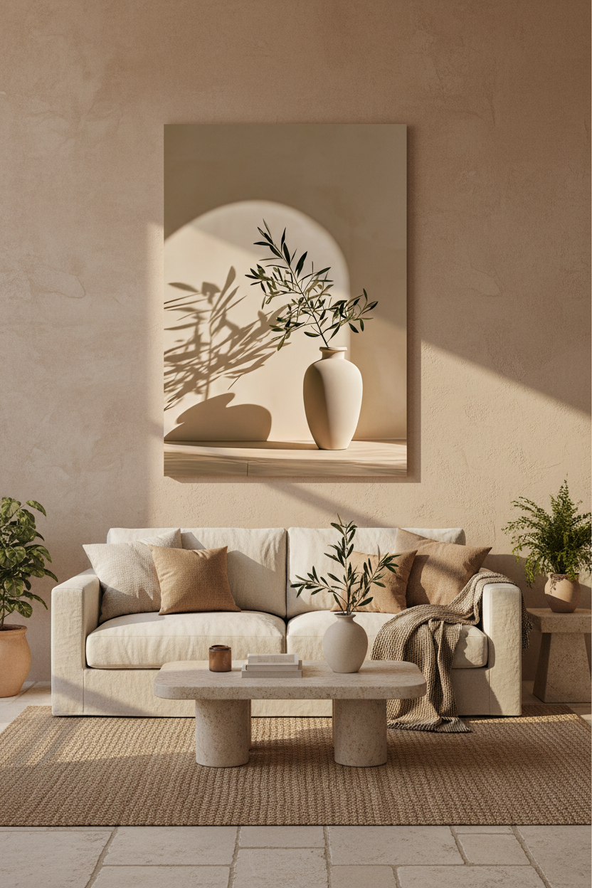
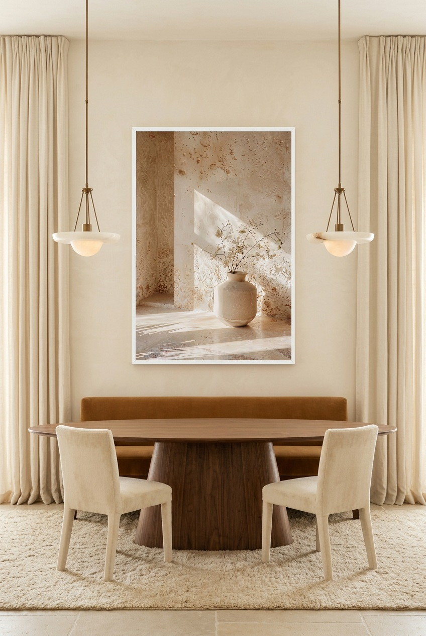
The Rest of the Vase — an object dominant, calm enough to be flanked by two textures.
Sizes: the same size, or different sizes?
Three identical sizes give a clean line, legible from a distance, easy to hang. It is the default choice, and it is rarely a mistake.
Three different sizes give a livelier set, but they require aligning something: either the horizontal centers, or the bottom edge. Never both.
What matters more than the size is the relationship to the width of the furniture: a composition of three posters should occupy about two thirds of the width of the sofa or the sideboard. Below that it looks lost, above it crushes the furniture.
- Three 30 × 40 cm — for a narrow piece of furniture, a console, a hallway.
- Three 50 × 70 cm — the size that suits the largest number of living room walls.
- One 50 × 70 flanked by two 30 × 40 — the hierarchy becomes visible before you even look at the images.
One point to check before confirming a basket: not all our posters offer the same sizes — some stop at A2, others go up to 70 × 100 cm. For three identical sizes, check that the size exists on all three. Details in our size guide.

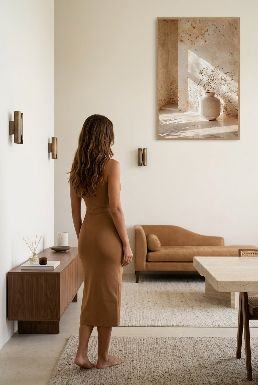
Natural Travertine — the typical companion: a material, not a subject.
Hanging the trio: spacing, height, frames
Once the three images are chosen, the hanging comes down to three figures.
- Spacing — 5 to 8 cm between the frames. Even, identical throughout.
- Height — the center of the whole composition, not of each poster, at 145-150 cm from the floor.
- Gap to the furniture — 20 to 25 cm between the top of the backrest and the bottom of the frames.
On frames, a simple principle: three identical frames, or no frame at all. Mixing one oak framed print with two bare posters brings out the frame, not the image. Our solid oak frame, like our black and white frames, arrives ready to hang.
Discover our Mediterranean wall art posters →
Composing your trio without getting it wrong
The hardest part is not choosing three images, it is knowing what they will look like together, on your wall, before ordering. A poster propped on the floor says nothing about how it will look at eye level, next to two others.
This is exactly what our gallery wall configurator does: you assemble your composition on screen, you see the proportions and the palettes answer each other, and you adjust before confirming. It is free, and it avoids the order you regret when you open the parcel.

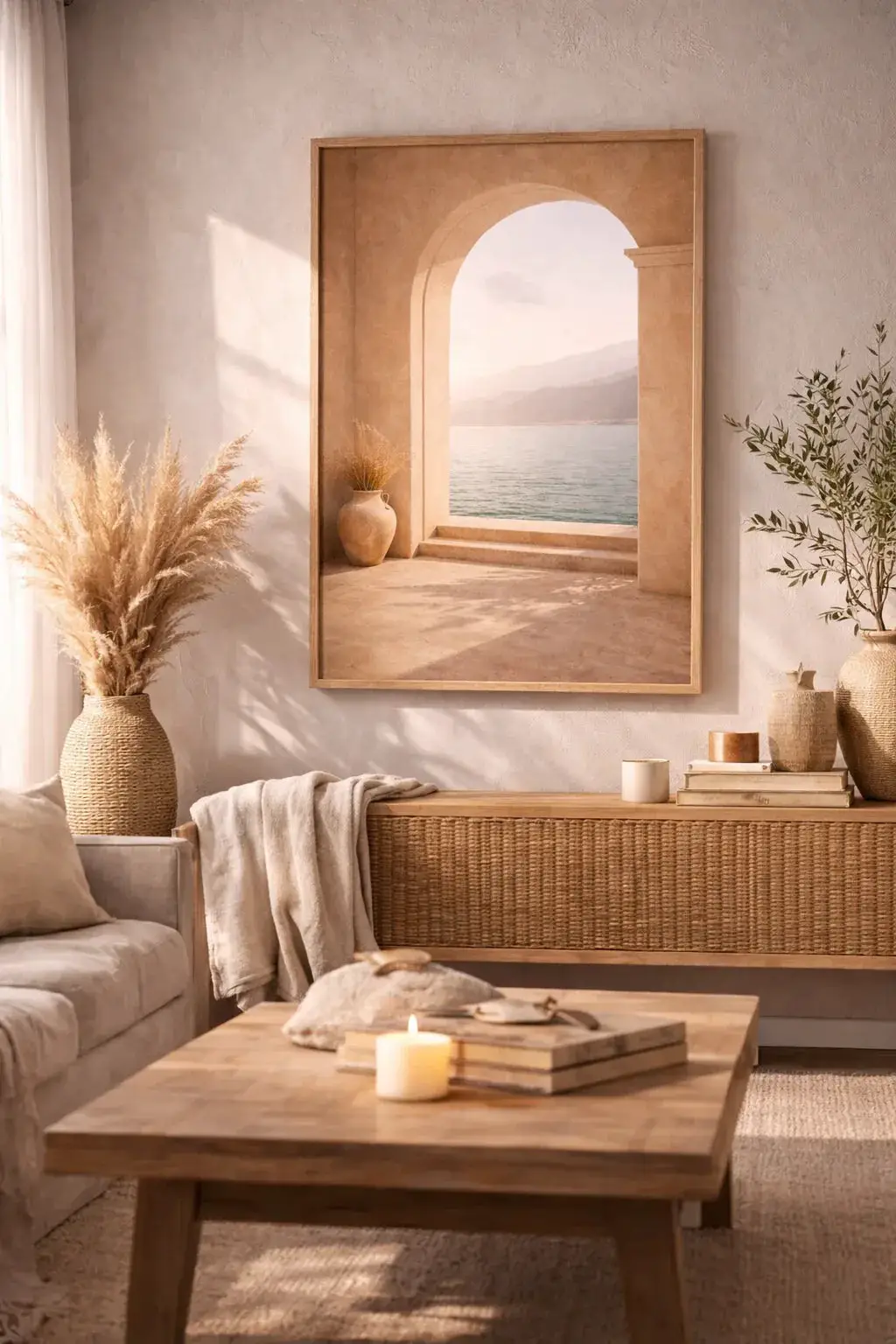
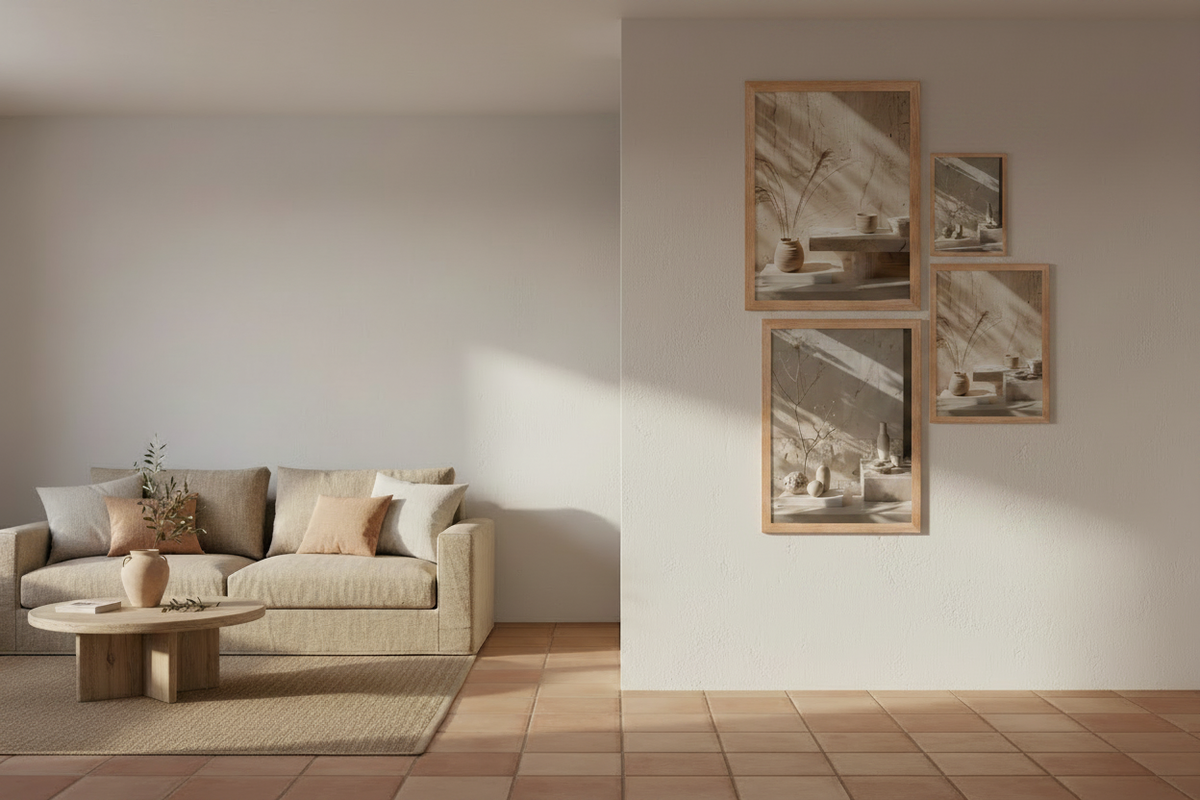
Mediterranean Arch — one of our most chosen posters, and a dominant that is easy to surround.
The mistakes that ruin a trio
- Three strong images — the most frequent flaw. Step back: if you do not know which one to look at first, there is one too many.
- Whites that are not the same — a cool white next to a warm ivory shows immediately once on the wall, while it goes unnoticed on screen.
- Three identical subjects — three arches, three vases, three faces. The set turns into a catalog page.
- Uneven spacing — 6 cm on one side, 9 on the other. The eye does not measure, but it sees it.
- A trio too small for its wall — the two thirds of the furniture width rule takes precedence over the budget. Better two large posters than three that are too small.
FAQ — Choosing three posters that work together
Do you have to buy the three posters at the same time?
It is not compulsory, but it is safer: shades are judged against one another, not in isolation. If you complete the set later, stay within the same collection and the same size. Our gallery wall configurator lets you test the addition before ordering.
Can you mix framed posters and bare posters?
It is possible, but it creates an unintended hierarchy: the frame draws the eye before the image. For a trio, choose a single finish. The comparison of the two options is detailed in our article poster or oak framed.
How much spacing should you leave between three posters?
5 to 8 cm between the frames, identical throughout. Below 5 cm the composition closes in, beyond 8 cm the three images stop forming a whole. The other hanging measurements are in how to hang a poster.
Are three posters enough for a large empty wall?
Not always. On a wide wall with no furniture beneath it, three medium sizes can look lost. We covered that specific case in decorating a large empty wall.
How much does a composition of three posters cost?
Our posters start at 19 € in 21 × 30 cm and at 39 € in 30 × 40 cm, across the whole catalogue, printed on 189 g/m² matte paper at 94 % opacity. Even in 21 × 30 cm, a trio therefore exceeds our free shipping threshold, set at 49 €.
See also: Composing a beige gallery wall — How to hang a poster — Which poster size to choose — Beige and wood living room: which posters to choose



Leave a comment
This site is protected by hCaptcha and the hCaptcha Privacy Policy and Terms of Service apply.