
Decorating a large empty wall: when there is nothing underneath
Reading time: 7 min
A wall above a sofa almost decorates itself. The furniture gives the width, the height of the backrest gives the line, and all that is left is to choose the image. The large bare wall gives you nothing. No furniture, no axis, no starting point — just a surface that waits, and that has an unfortunate tendency to make everything you hang on it look small.
It is the back wall of a dining room, the stairway, the wide stretch of hallway, the side wall of a through living room. All the usual advice is unusable there: it all rests on a piece of furniture underneath. Here is how to handle a large empty wall with no anchor point.
Why this wall resists when the others do not
The most widespread composition rule — the image should be about two thirds of the width of the furniture — is not an aesthetic rule. It is a rule of proportion. It works because a piece of furniture gives the eye a reference.
Without furniture, that reference disappears, and two things happen. The first: you undersize. A poster that looked large standing on the floor becomes a postage stamp across three metres of wall. The second: you drift. Nothing tells you what height to hang at, so you hang too high — the most common mistake, and the most visible.
The bare wall therefore calls for the opposite of the usual reflex: you have to set a reference first, then choose the image.
Setting the reference: three measurements before choosing anything
Take a tape measure and write down three numbers. They decide everything else.
- The free width of the wall — from corner to corner, or between the two nearest obstacles (door, window, radiator). This is your real working surface, often smaller than the whole wall.
- The available viewing distance — how far back you will stand to look at it. In a hallway, one metre. In a dining room, three or four. The greater the distance, the larger the image has to be.
- Eye level — about 150 cm from the floor for a wall you look at standing up. Seated, in a living room or a dining room, drop to 140 cm. The centre of the image, or the visual centre of the composition, sits on that line. Not the top of the frame.
These three numbers replace the missing furniture. From there on, the wall stops being a void and becomes a frame.

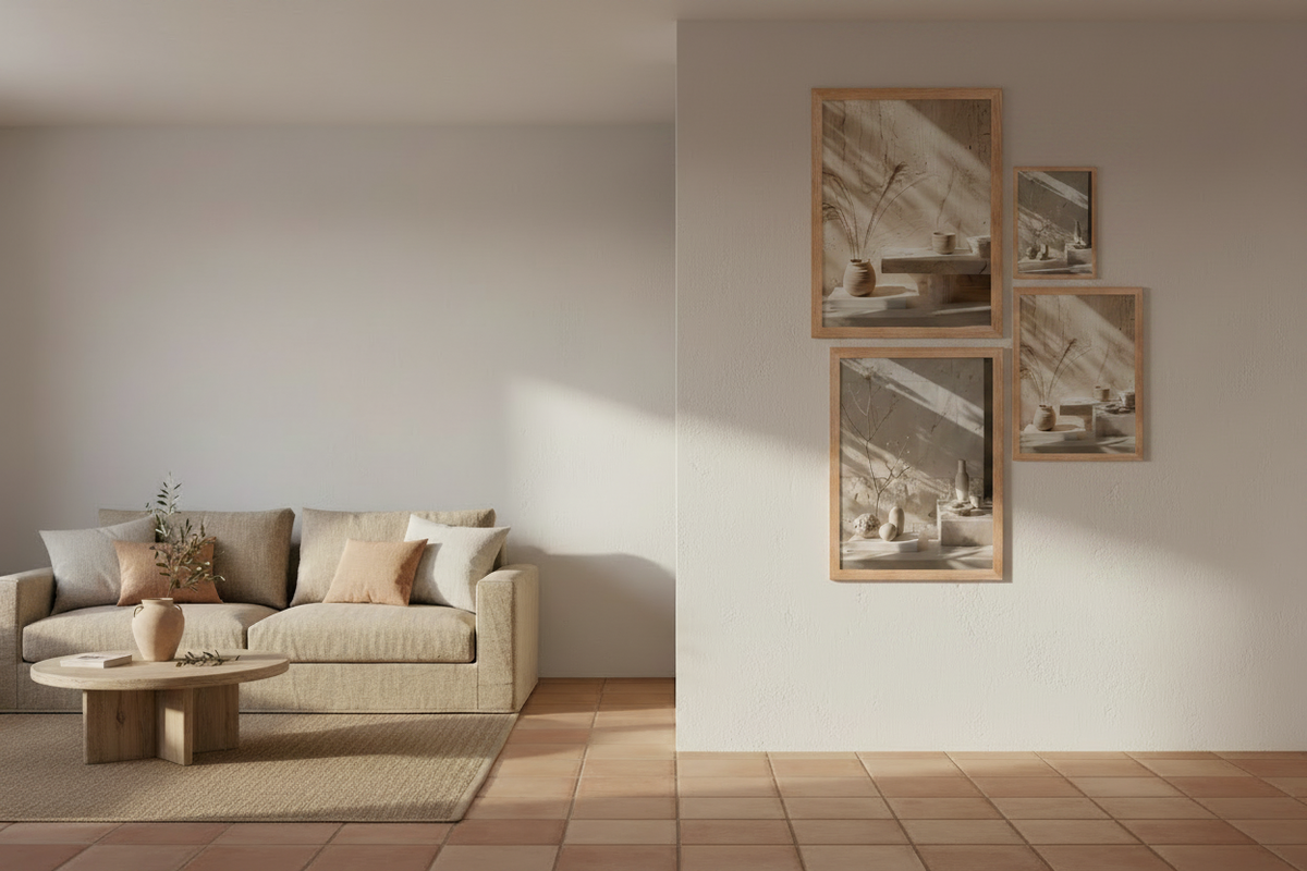
The same wall, before. No furniture to give the scale.
Three ways to handle a wall with no furniture
There are not five solutions. There are three, and they do not ask for the same commitment.
The single piece. One image, frankly large, centred on the eye line. It is the calmest solution and the hardest to get wrong. It calls for a size that is almost always underestimated: on a three-metre wall, an A2 disappears. Count on a 61 × 91 cm at the very least, ideally a 70 × 100 cm.
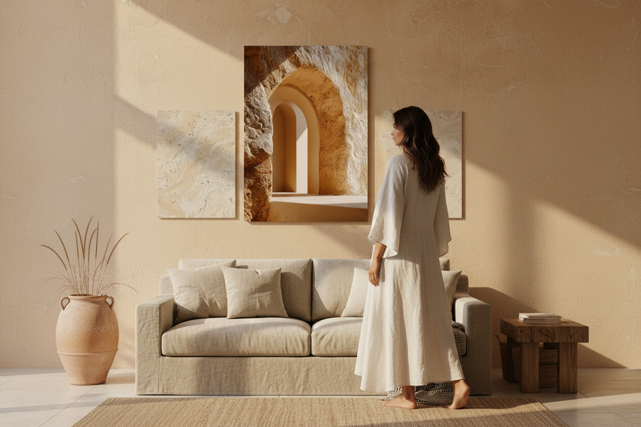
The symmetrical composition. Two or three images of identical size, aligned on their horizontal axis, evenly spaced. It fills the width without demanding a very large size, and it reads as a decision rather than as filler. It is the safest solution on a wide, low wall.
The free composition. Mixed sizes, aligned on a common axis — the bottom, the top or the middle. Livelier, riskier: with no furniture to contain it, it quickly looks as though it has spilled over. Keep it for very wide walls, and only if you hold to a tight palette.

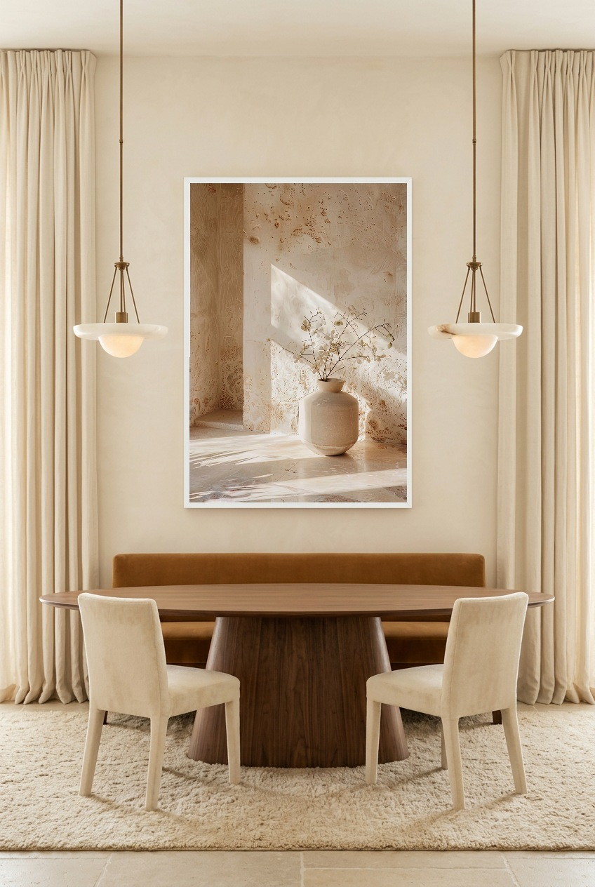
The Rest of the Vase in a composition of three — the safest solution on a wide wall
What "large" means in centimetres
"Large format" stays an elastic notion until you put it in numbers. Here are the useful benchmarks for a wall with no furniture.
- A1 — 59.4 × 84.1 cm — the first genuinely large size. Suits a wall of 1.5 to 2 m as a single piece, or a composition of two on a wider wall.
- 61 × 91 cm — a step above, closer to the proportions of a painting. This is the size that holds on its own on a wall of 2 to 2.5 m.
- 70 × 100 cm — the size that settles the question on a wall of 3 m and over. On its own, centred, it needs nothing else.
Not every design is offered in every size: availability depends on the model. Check the size selector on the product page before settling your composition. See our large format posters.

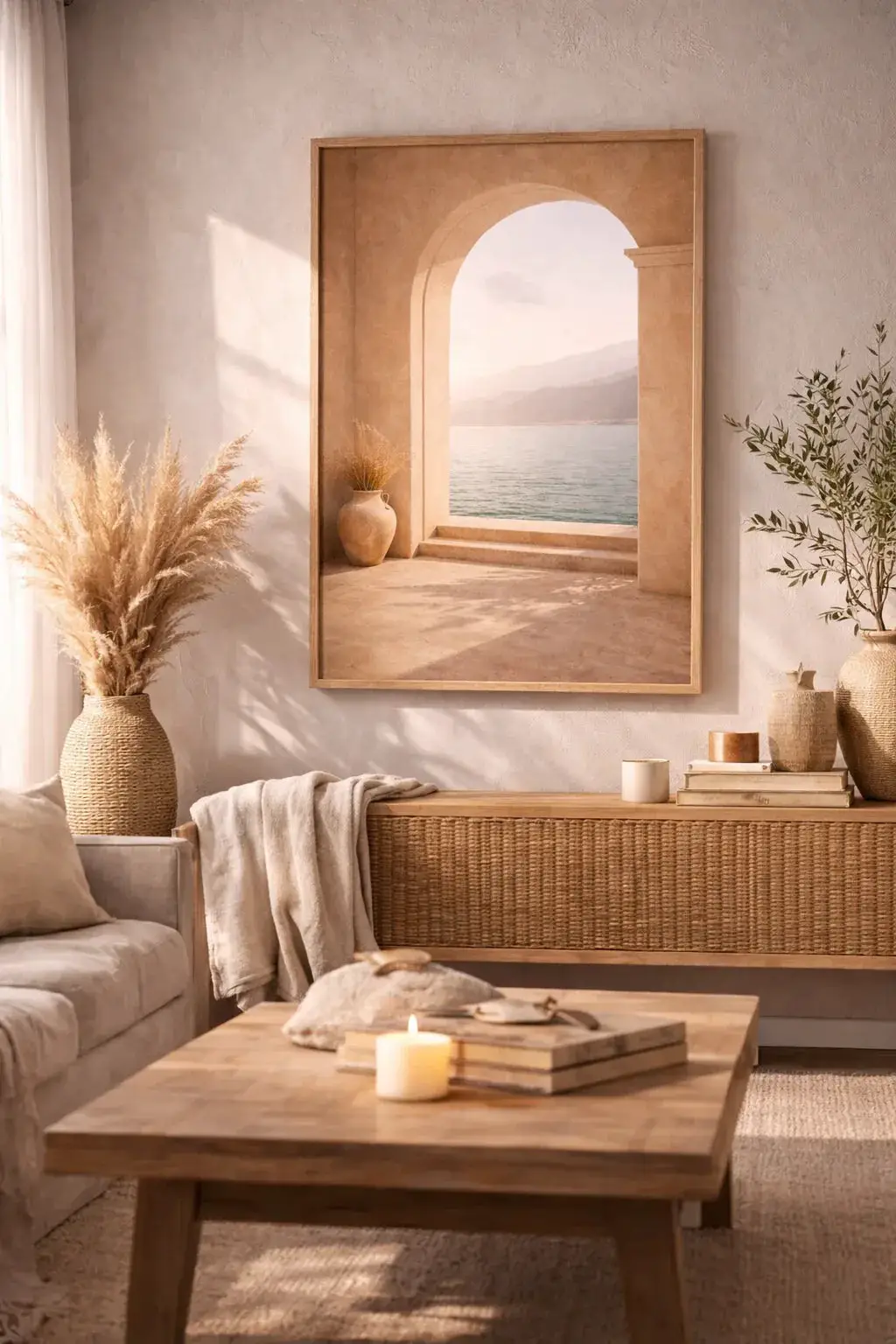
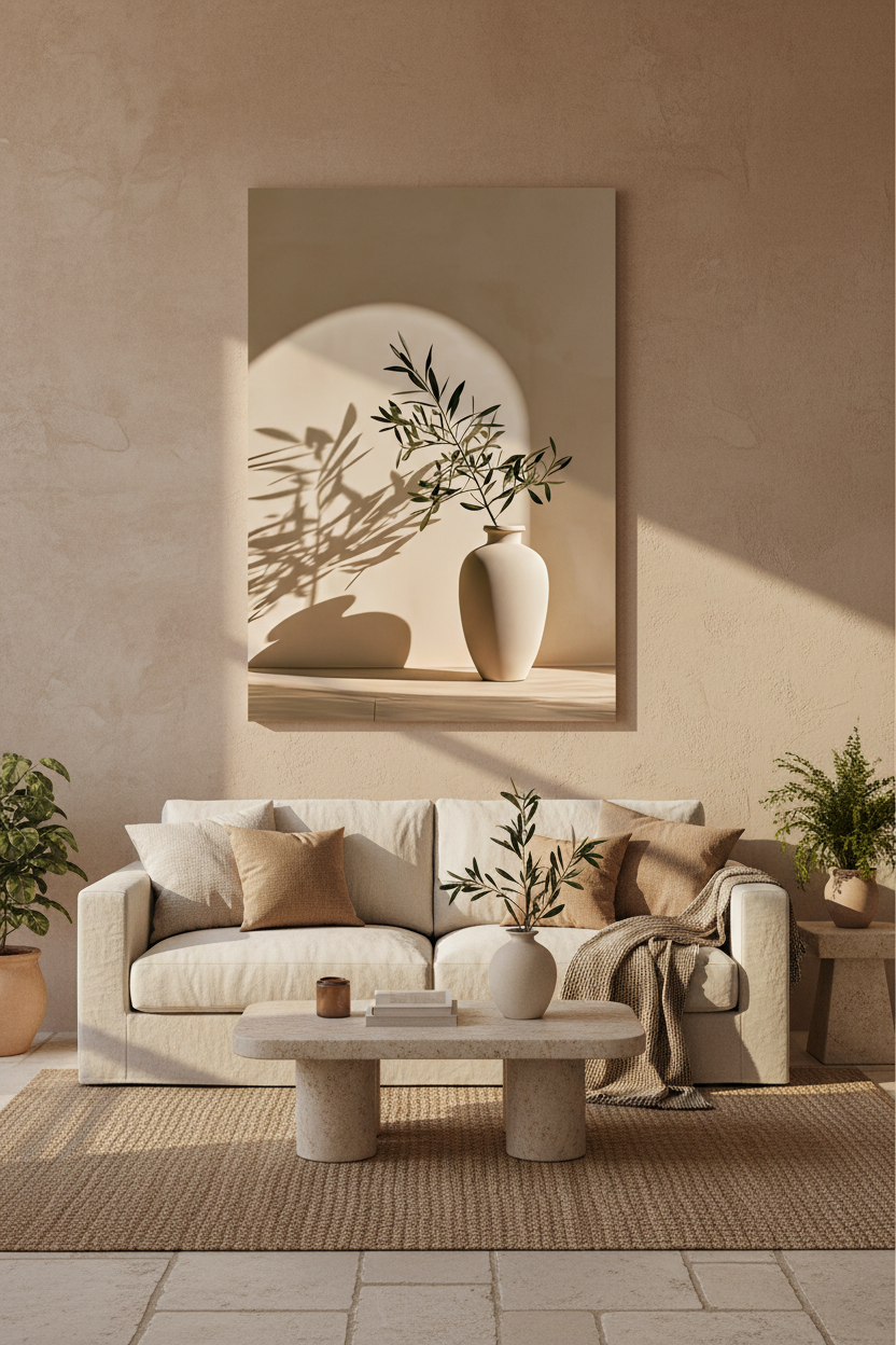
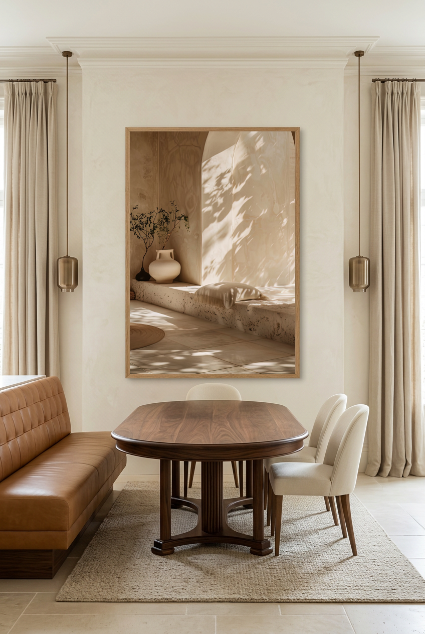
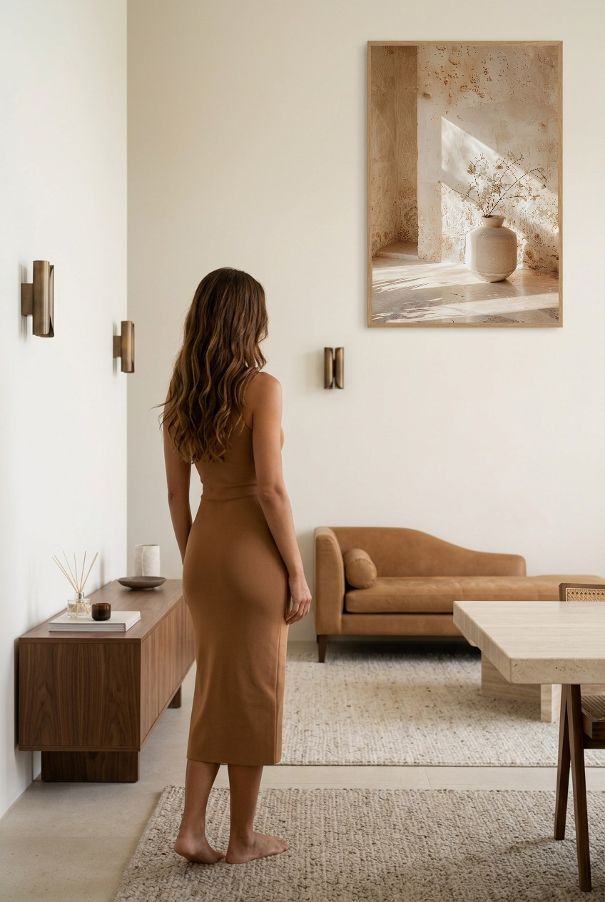
The Woodwork, available up to 70 × 100 cm — the single piece on a tall wall
Which designs hold up on a large surface
A large size does not behave like a small one blown up. Seen from a distance, what is left of an image is its structure: a line, a curve, a contrast. The detail disappears.
- A bold shape — an arch, a cast shadow, a flat plane of stone. It reads at four metres just as it does at forty centimetres. See the Architecture collection.
- A generous texture — travertine, limestone, plaster. On a large surface, the material becomes the subject and the wall gains depth. See the Minéral collection.
- A play of shadow — the image with the most sparing means, and the one that best withstands scale. See the Lumière collection.
Conversely, finely detailed designs and busy compositions lose everything when enlarged: from a distance, they turn into a smudge.
Discover our Mediterranean wall posters →
See the wall before deciding
The real obstacle of the bare wall is not the choice of design: it is that you cannot picture it. An image standing on the floor against a skirting board tells you nothing about what it will look like at 150 cm high, from three metres back.
That is exactly what our gallery wall configurator is for: placing one or several posters on a wall, seeing the proportions, changing size, and deciding before ordering rather than after.

Before — the bare wall, with no scale reference

After — the same surface, once the composition is in place. Try the configurator
Four mistakes that keep coming back on large walls
- Hanging too high. This is mistake number one, and it comes from the absence of furniture: with no reference, the hand rises. Bring the centre back down to 150 cm, or 140 cm in a room where you are seated.
- Undersizing. A poster always looks bigger in the hand than on the wall. When in doubt, take the size above: too much size is forgiven, too little is not.
- Centring on the wall rather than on the room. If the wall is broken by a door or an opening, the geometric centre is not the visual centre. Centre on the free surface, not on the partition.
- Filling for the sake of filling. A large wall can stay partly empty. The emptiness around an image is part of the composition — it is even what sets it off.
FAQ — Decorating a large empty wall
What poster size for a 3 m wall?
As a single piece, a 70 × 100 cm. In a composition, three identical 50 × 70 cm aligned, or two 61 × 91 cm. Below A1, a single poster gets lost across that width.
At what height should you hang on a wall with no furniture?
The centre of the image — or the visual centre of the composition — at about 150 cm from the floor, 140 cm in a room where you look at it seated. It is the centre you align, never the top of the frame.
One large poster or several small ones?
One if the wall is tall and the viewing distance long: it is calmer and harder to get wrong. Several if the wall is wide and low, keeping identical sizes and even spacing. See our living room advice.
How do you tell what it will look like before buying?
By visualising it. Our gallery wall configurator lets you place posters on a wall and compare sizes before ordering.
Should you frame on a large wall?
A frame adds a border that structures the image and sets it apart from the wall — useful when the wall colour is close to that of the poster. On a strongly contrasting wall, the bare poster is enough. See our oak framed posters.
See also: Large format poster — Gallery wall configurator — Living room wall poster — Oak framed poster — Beige and wood living room: which posters to choose



Leave a comment
This site is protected by hCaptcha and the hCaptcha Privacy Policy and Terms of Service apply.