
What color pairs well with terracotta? Effective color combinations
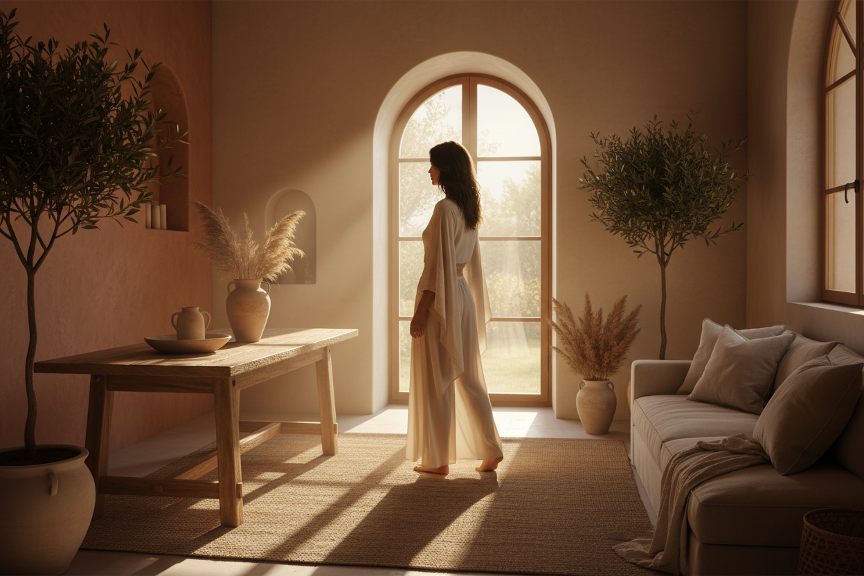
Terracotta has established itself as one of the key shades in contemporary decor. Warm, earthy, inspired by baked clay and Mediterranean landscapes, it warms up an interior without ever weighing it down. The trick is knowing what to pair it with. Too much terracotta and the room becomes stifling; the right combinations, on the other hand, reveal its full depth. Here are the most successful pairings and how to showcase them on your walls.
Terracotta and beige: understated elegance
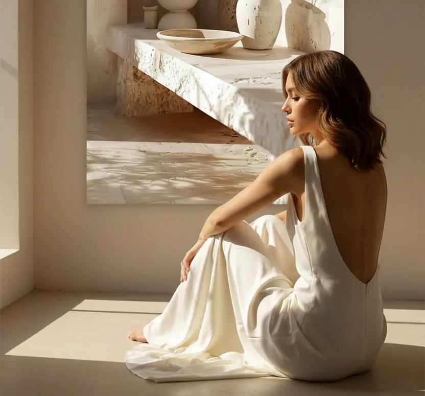
This is the safest and most timeless combination. Beige, sand, and ivory soften the intensity of terracotta and create a cozy atmosphere reminiscent of desert tones. This range of earthy hues works especially well in a living room or bedroom, where calm is sought. To enhance this effect, a poster in sand and clay shades extends the palette seamlessly. In the living room, this pairing deserves special treatment: we detail its staging in our article terracotta and beige in the living room.

Terracotta and sage green: the duo of the year
If one combination dominates current trends, it’s this one. Sage green, soft and slightly grayish, brings a vegetal freshness that balances the warmth of terracotta. The result evokes a Mediterranean garden: olive trees, dusty foliage, terracotta earth. It’s a natural, soothing marriage, ideal for those who want character without excess. We’ve dedicated a complete guide to it: terracotta and sage green, the decor duo of the year.
Terracotta and off-white: light above all
Pure white can create too harsh a contrast. Off-white, cream, or linen, on the other hand, let terracotta breathe and amplify the room’s brightness. This pairing is perfect for small spaces and minimalist interiors, where simplicity highlights the color.

Terracotta and deep blue: controlled contrast
For a bolder decor, navy blue or Mediterranean blue offers a vibrant contrast. The two shades respond to each other like earth and sea. Use them in touches—a wall, a textile, a poster—to avoid overload.
Terracotta and black: the graphic touch
A few black accents (frames, graphic lines, lighting) structure a terracotta decor and give it a more contemporary look. Black acts like punctuation: in small doses, it enhances without dominating.
Mistakes to avoid
Three common pitfalls: saturating the room with terracotta on every surface, pairing it with cold and garish shades that break its warmth, or neglecting natural light—terracotta reveals its full richness under soft, warm light. The golden rule: one dominant shade, one or two supporting tones, and measured accents.
How to incorporate terracotta through walls
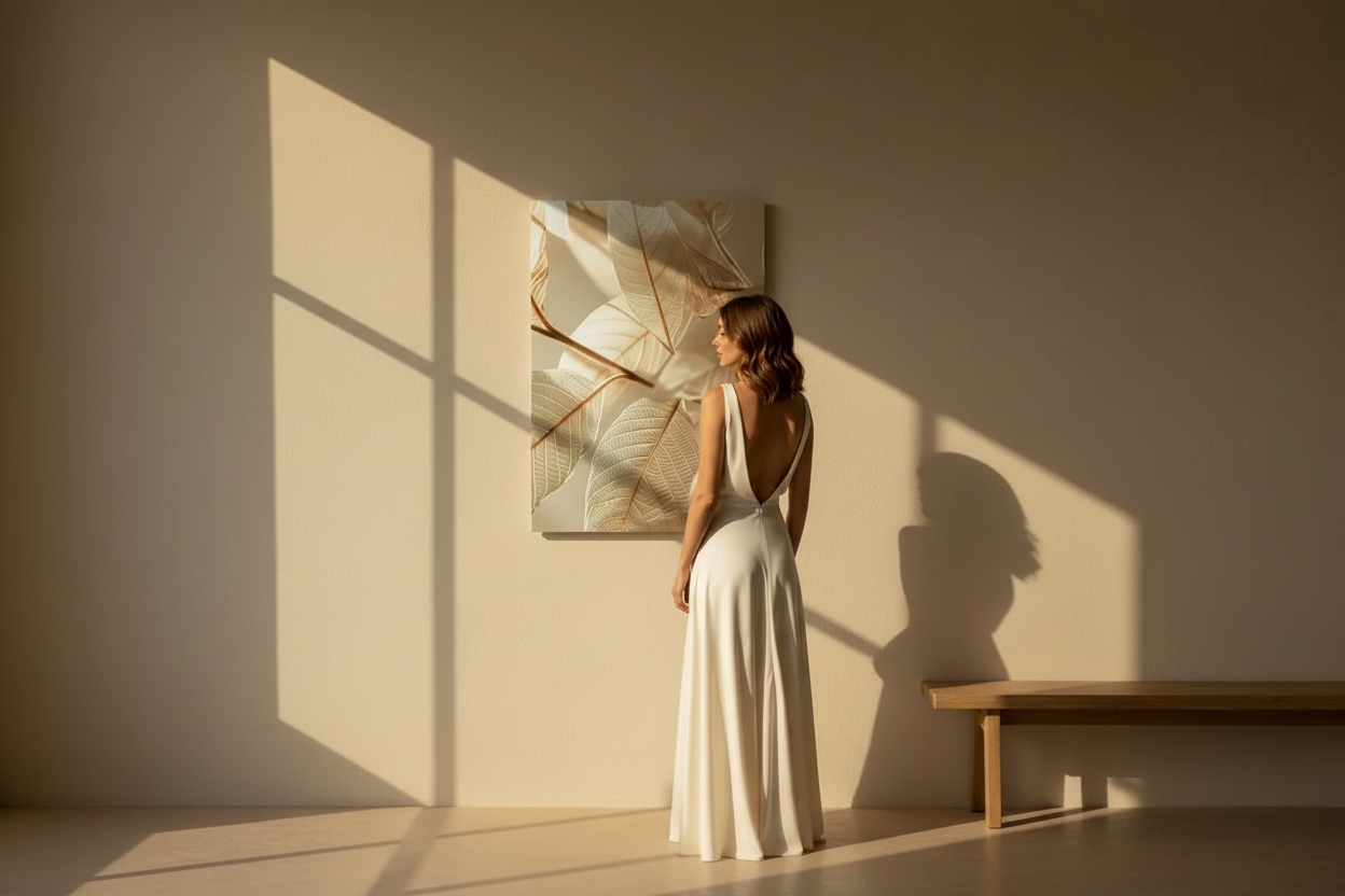
Repainting an entire wall is a strong commitment. A wall poster allows you to introduce terracotta in a reversible and controlled way: a clay-toned poster above a sofa, a trio of posters in an entryway, a wall composition in the bedroom. It’s the simplest way to test the color before committing further.

In summary
Terracotta pairs ideally with neutrals (beige, off-white), brightens up with sage green, asserts itself with deep blue, and is structured with touches of black. In all cases, balance and light remain key. To compose your palette, explore our terracotta poster collection and our ochre-toned posters. To go further, discover how to combine sand, ivory, and terracotta.
Discover our terracotta posters →

FAQ — Pairing terracotta
What is the easiest pairing with terracotta?
Beige and its variations (sand, cream, ivory): these are the safest partners. They soften terracotta and create a warm, timeless atmosphere without risk of bad taste.
Is terracotta suitable for a small room?
Yes, provided it’s used sparingly. Use it in touches—a poster, a textile, an accent wall—and pair it with light neutrals to preserve the space’s brightness.
Which Mediterranean wall poster to choose for terracotta decor?
Favor posters in clay, sand, or ochre tones that naturally extend the palette. Mineral motifs, abstract faces, or Mediterranean architecture fit perfectly into a terracotta interior without creating visual breaks.
Can terracotta be mixed with bright colors?
With caution. Terracotta does not tolerate cold and saturated shades well. Prefer natural and slightly desaturated colors—sage green, deep Mediterranean blue, golden ochre—that harmonize with its warmth without contradicting it.

Leave a comment
This site is protected by hCaptcha and the hCaptcha Privacy Policy and Terms of Service apply.