
Terracotta and sage green: the decor duo of the year
For several seasons now, a color combination has been appearing everywhere in the most carefully designed interiors: terracotta and sage green. This duo is no coincidence. It brings together the warmth of terracotta and the freshness of a delicately grayish green, resulting in a natural, soothing, and distinctly Mediterranean look. Here’s why it works, which room to adopt it in, and how to extend it onto your walls.
Why terracotta and sage green work so well together
The secret lies in the balance of temperatures. Terracotta is a warm, earthy, almost sunlit color; sage green is a soft, slightly powdery and grayish green that adds a fresh note without ever feeling cold. One warms, the other soothes. Together, they evoke a Mediterranean landscape: the terracotta of rooftops and the silvery foliage of olive trees. It’s this reference to nature that makes the combination so restful to the eye.

Which room to adopt this duo in
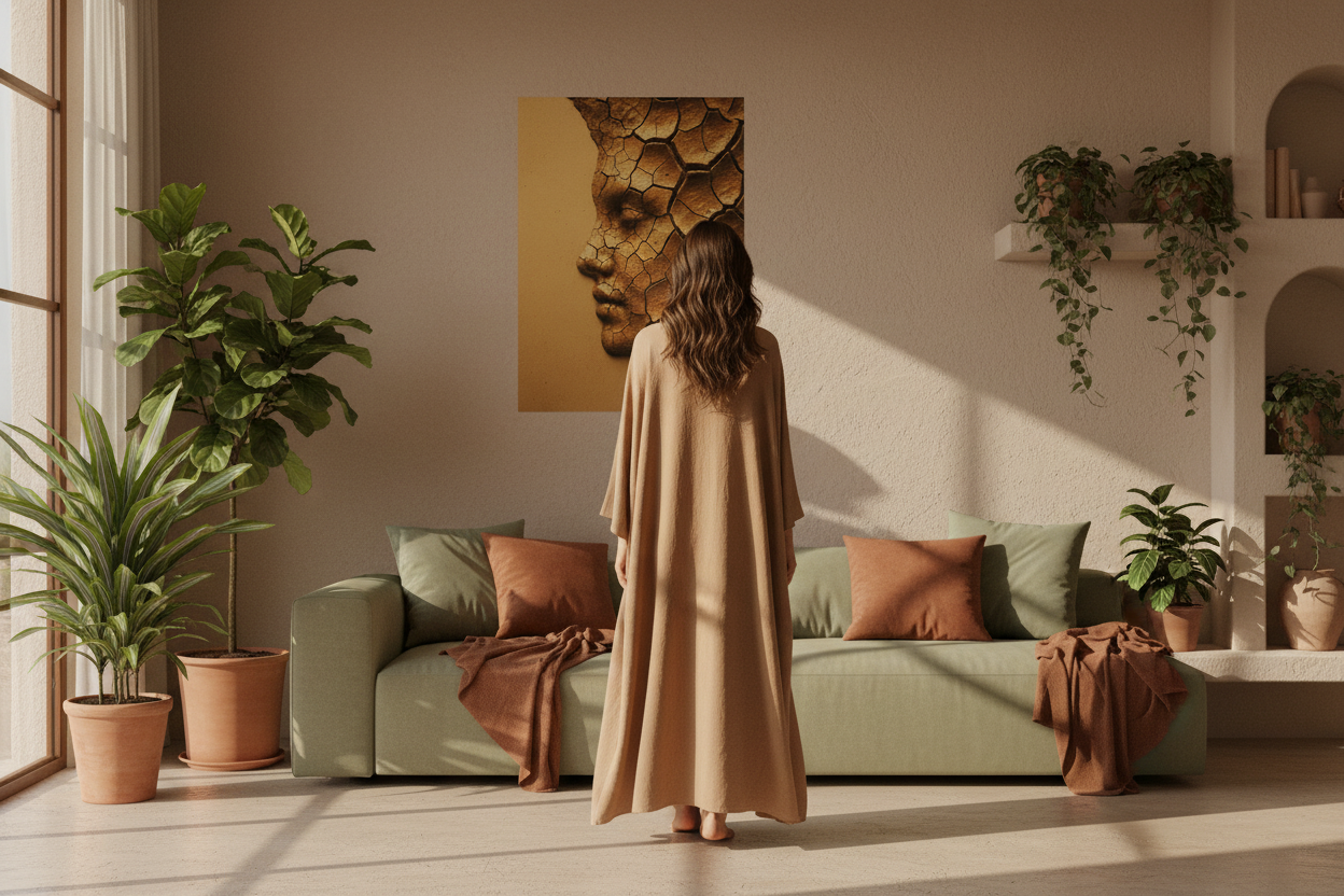
The terracotta-sage duo adapts to almost any room, provided you balance it well. In a living room, it creates a warm and lively atmosphere: a terracotta wall or textiles, with touches of sage through cushions or plants. In a bedroom, the proportions are often reversed — sage dominant, terracotta as an accent — for a softer cocoon. In an entryway or kitchen, the duo works in small doses: a poster, a textile, a ceramic piece.

Materials that enhance the duo
These two shades call for natural, matte materials. Linen and washed cotton for textiles, light wood and rattan for furniture, ceramics and terracotta for objects. Avoid shiny or synthetic finishes, which break the softness of the whole. It’s the material, as much as the color, that gives this duo its authentic character.

Which posters carry the terracotta-sage duo
On the walls, look for visuals that naturally contain one or the other shade: a silver-leaf olive tree, powdery foliage, a mineral composition in clay tones. A terracotta poster placed near sage foliage is enough to establish a dialogue between the two colors. Explore our terracotta poster collection and our botanical posters to effortlessly create this harmony.
Errors to avoid
- Using both colors equally on all surfaces — the overall effect quickly becomes heavy. Choose a dominant color and an accent color.
- Choosing a sage that is too bright or too blue — it would lose its softness and clash with the warmth of terracotta. Stick to a grayish green.
- Forgetting neutrals — a beige, sand, or cream background is essential to let the duo breathe.
- Multiplying patterns — with two strong colors, keep posters and textiles in simple, organic patterns.
Discover all our wall posters →

FAQ — Terracotta and sage green
Which dominant color should I choose between the two?
It all depends on the desired atmosphere. Terracotta as dominant creates a warmer, more enveloping room; sage green as dominant creates a fresher, more relaxing atmosphere. In both cases, keep the second color as an accent and support everything with neutrals.
Is this duo suitable for a small room?
Yes, provided you keep terracotta in small touches and favor sage and light neutrals on large surfaces, so as not to darken the space. A single terracotta poster can be enough to warm up a small room.
Which wall poster should I choose for a terracotta and sage green interior?
Favor posters that naturally contain one of the two shades: abstract terracotta faces, olive green foliage, clay mineral compositions. Avoid posters with cold or overly saturated colors that would break the natural harmony of the duo.
Can other colors be combined with the terracotta-sage duo?
Yes. Beige and sand are ideal neutrals to let the duo breathe. Golden ochre warms it even more. Off-white adds light. However, avoid blue, bright pink, or purple, which break the Mediterranean harmony.
To explore other terracotta combinations, check out our guide Mediterranean colors: sand, ivory, terracotta.

Leave a comment
This site is protected by hCaptcha and the hCaptcha Privacy Policy and Terms of Service apply.