
The Japandi Style: A Guide to Decor and Wall Art
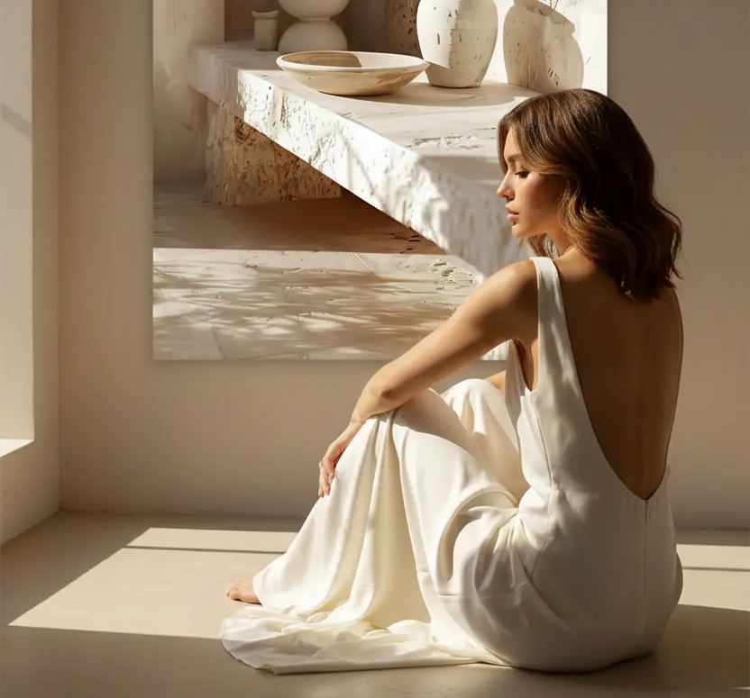
Born from the meeting of Japanese minimalism and Scandinavian functionalism, the Japandi style has become one of the most sought-after decor trends. Clean without being cold, warm without being cluttered, it captivates with its balance. Here is a complete guide to understanding Japandi and adopting it, right on your walls.
What is the Japandi style?
The word “Japandi” combines “Japan” and “Scandinavia.” The style borrows from the former its taste for simplicity, craftsmanship, and raw materials; from the latter, its functionality, light, and cozy comfort. The result is a minimalist yet welcoming interior, where every object is chosen for its quality and appropriateness rather than accumulation.
Japandi or wabi-sabi: what’s the difference?
They are often confused. Wabi-sabi is a Japanese philosophy: celebrating the beauty of imperfection and the passage of time. Japandi, on the other hand, is a hybrid decorative style, more structured and more “design,” which draws on this sensibility while incorporating Scandinavian rigor. In other words, wabi-sabi is a mindset; Japandi is a concrete aesthetic inspired by it. To explore the philosophical dimension further, read our article on wabi-sabi and wall art.

Japandi colors and materials
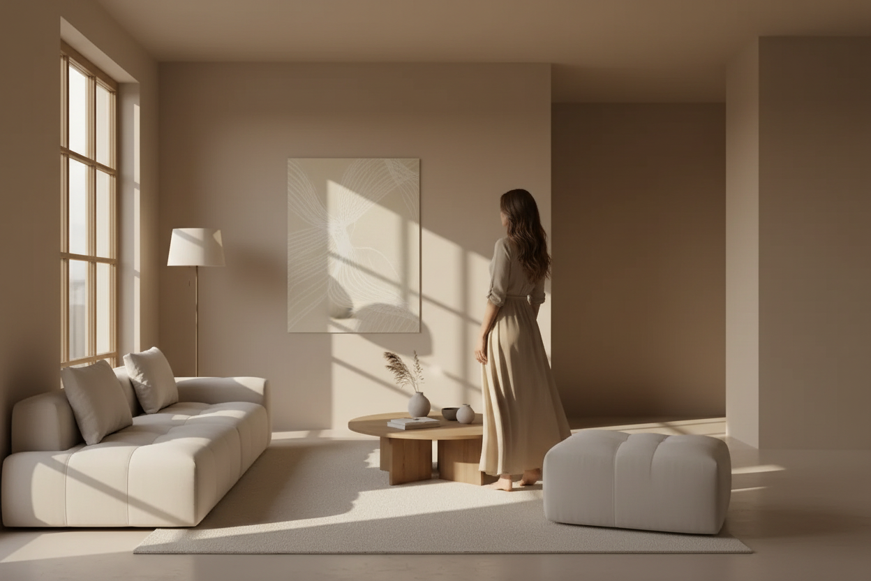
The Japandi palette is sober and natural: beige, ivory, taupe, soft gray, enhanced with touches of black or dark wood for depth. As for materials, light wood, linen, matte ceramics, rattan, and stone are favored. It’s all about natural textures and clean lines.

Which posters for a Japandi interior?
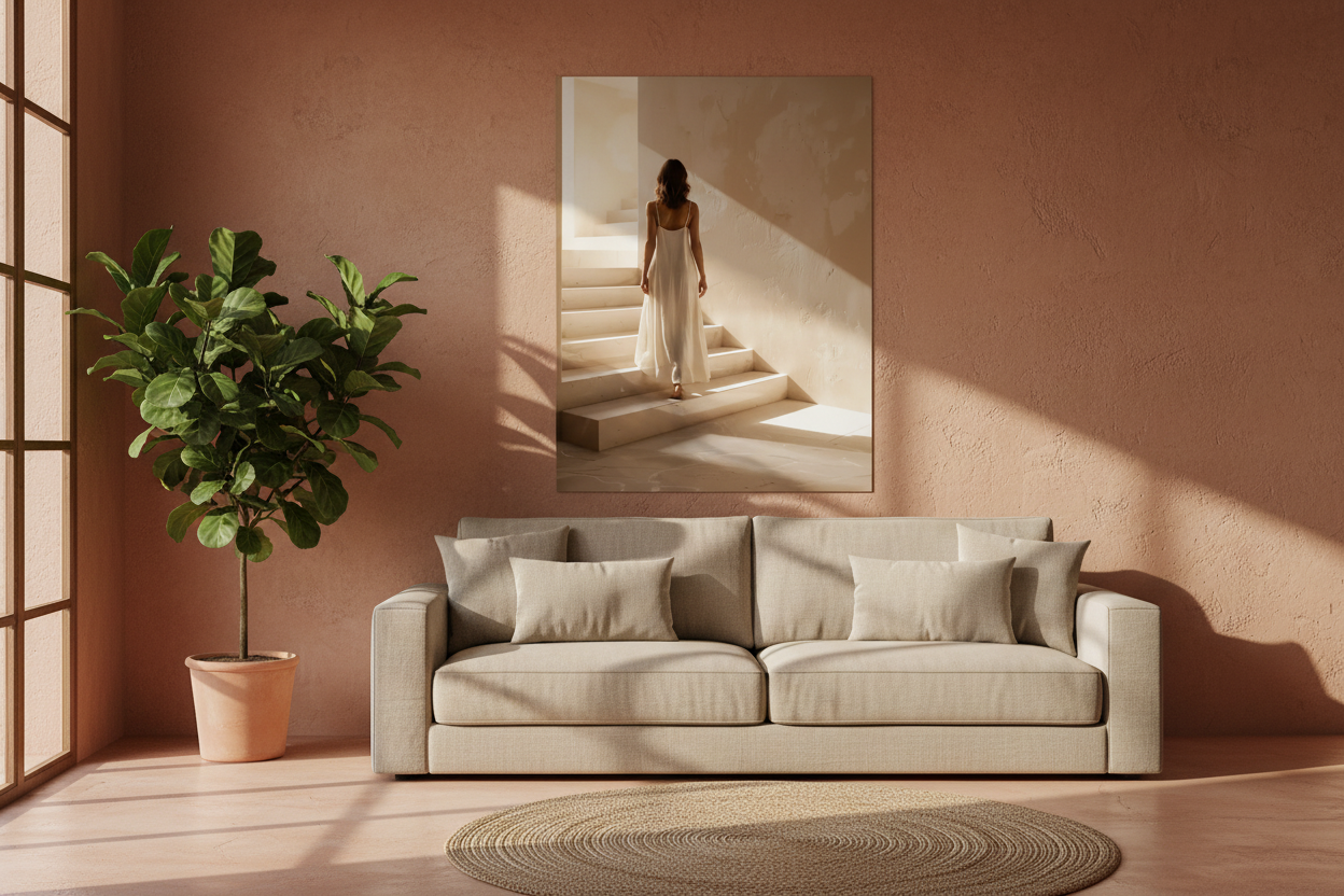
On the walls, Japandi calls for minimalist posters: simple lines, neutral tones, airy compositions. One well-chosen piece is better than clutter. Our ivory and cream and beige and sand posters naturally fit this spirit. To choose the right one, follow our minimalist wall poster guide.

Mistakes to avoid
- Confusing simplicity with coldness — Japandi remains warm thanks to natural materials and warm tones.
- Overfilling — emptiness is part of the style. Let the walls breathe.
- Multiplying colors — stick to a neutral and coherent palette.
- Choosing posters that are too graphic or colorful — Japandi calls for sober, textured visuals in natural tones. A brightly colored poster immediately breaks the harmony.
Discover our minimalist posters →

FAQ — The Japandi style
Is Japandi suitable for small spaces?
Perfectly. Its simplicity and light palette visually enlarge the space, while natural materials avoid a cold or impersonal feel.
How many posters for a Japandi wall?
Few. One large isolated poster or a spaced duo is enough. Japandi always favors quality and emptiness over accumulation.
Which wall poster to choose for a Japandi interior?
Favor posters with natural textures and ivory, beige, or taupe tones: mineral compositions, clean architectures, sober organic patterns. Avoid bright colors and overly busy patterns that contradict the Japandi aesthetic.
Japandi and Mediterranean, are they compatible?
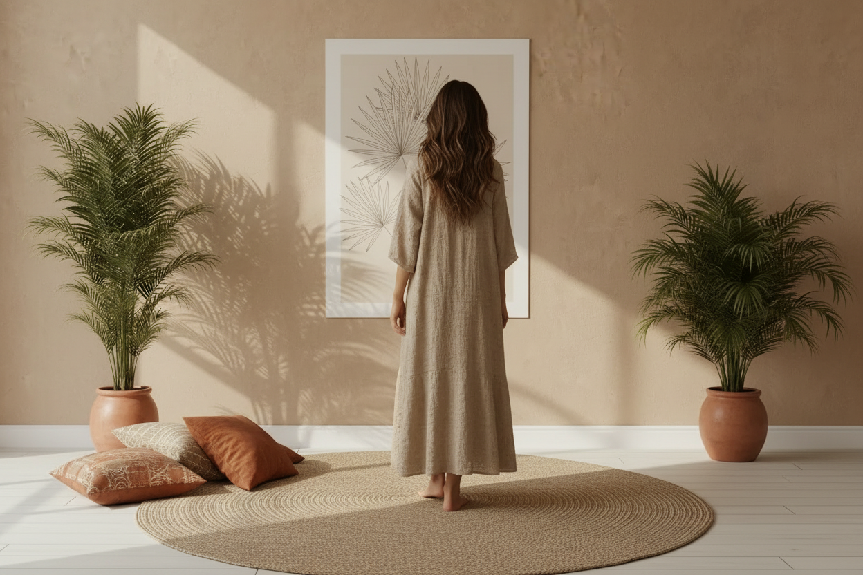
Yes, both styles share a love for natural materials, neutral tones, and light. A Japandi interior with Mediterranean accents — stone, ceramics, linen — creates a particularly calm and authentic atmosphere.

Leave a comment
This site is protected by hCaptcha and the hCaptcha Privacy Policy and Terms of Service apply.