
Boho chic decor: how to embrace it without overdoing it
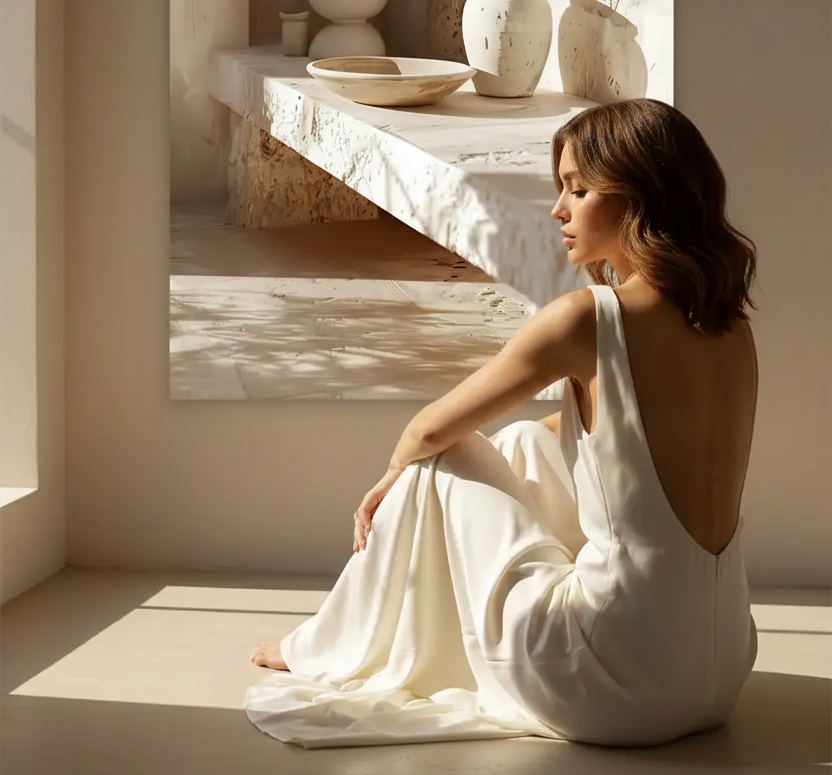
Boho chic decor is a successful paradox: the free-spirited, wandering soul of boho, but tamed, refined, made elegant. It’s a warm and personal style, as long as you avoid one pitfall: overload. Here’s how to embrace boho chic with balance, supported by palettes and posters.
The principles of boho chic
Boho chic is based on three ideas: abundant natural materials, a warm earthy palette, and a controlled layering of textures. Where classic boho accumulates, boho chic selects: a few beautiful pieces, natural materials, and lots of light. This restraint is what shifts the style from “cluttered” to “elegant.”
The palette: earth, terracotta, ochre, and beige
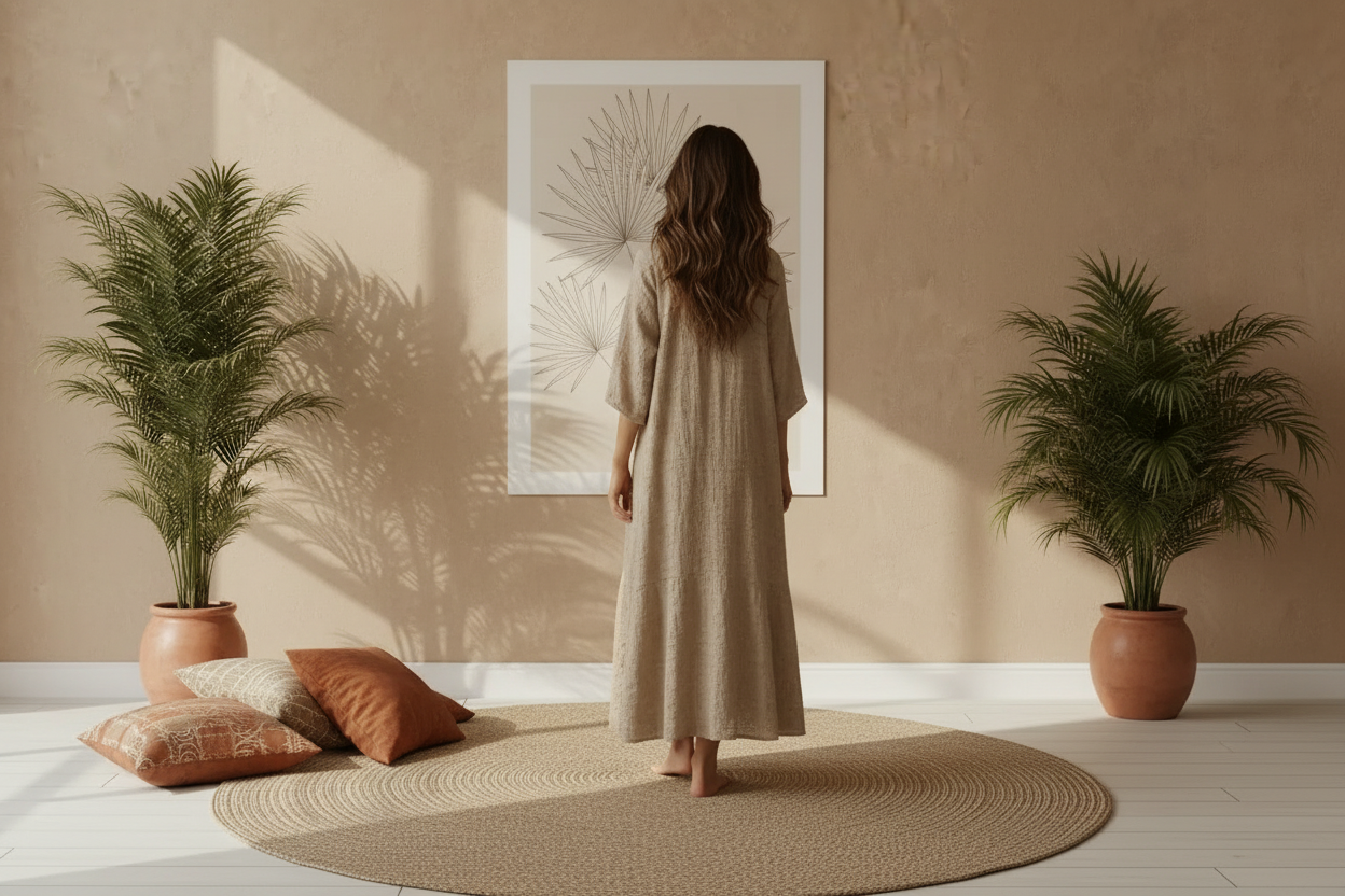
The colors of boho chic come from nature: terracotta, ochre, sand, beige, soft browns, sometimes highlighted with olive green or graphic black. This warm, neutral base is the style’s signature — it immediately creates a cozy atmosphere.

Materials and textures
This is the heart of boho chic. Rattan, jute, washed linen, macramé, raw wood, handcrafted ceramics: the focus is on layering natural textures rather than colors. A jute rug, a linen throw, a wicker basket — and the boho spirit is there, without overload.

Avoiding overload: the golden rule
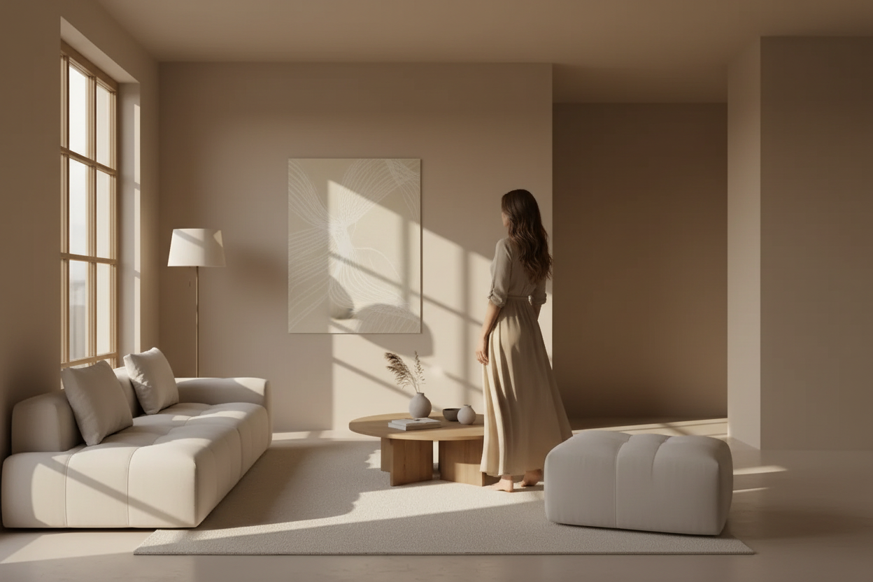
The boho trap is “too much”: too many objects, too many patterns, too many colors. Boho chic demands discipline. Keep empty spaces, limit patterns to one or two, and let each piece breathe. A clean wall with a beautiful poster is better than a crowded gallery of frames.
Which posters for boho chic decor
Choose organic, textured visuals in earthy tones: mineral silhouettes, foliage, soft abstract shapes. Our beige and sand and botanical posters perfectly suit this natural, warm spirit.

Mistakes to avoid
- Accumulating too many posters — a boho chic wall features one or two strong pieces, not an overloaded gallery.
- Mixing too many patterns — choose a dominant pattern (botanical, mineral, or abstract) and stick to it.
- Colors that are too bright — boho chic lives in muted, natural tones. A poster with saturated colors breaks the harmony.
- Frames that are too elaborate — prefer the bare poster, flush on the wall, to keep the style’s lightness.
Discover all our wall posters →

FAQ — Boho chic decor
What’s the difference between boho and boho chic?
Boho accumulates patterns, colors, and objects for a rich effect. Boho chic keeps the natural, warm spirit but refines it: fewer pieces, a tighter palette, more empty space. It’s a disciplined and elegant boho.
Is boho chic compatible with Mediterranean interiors?
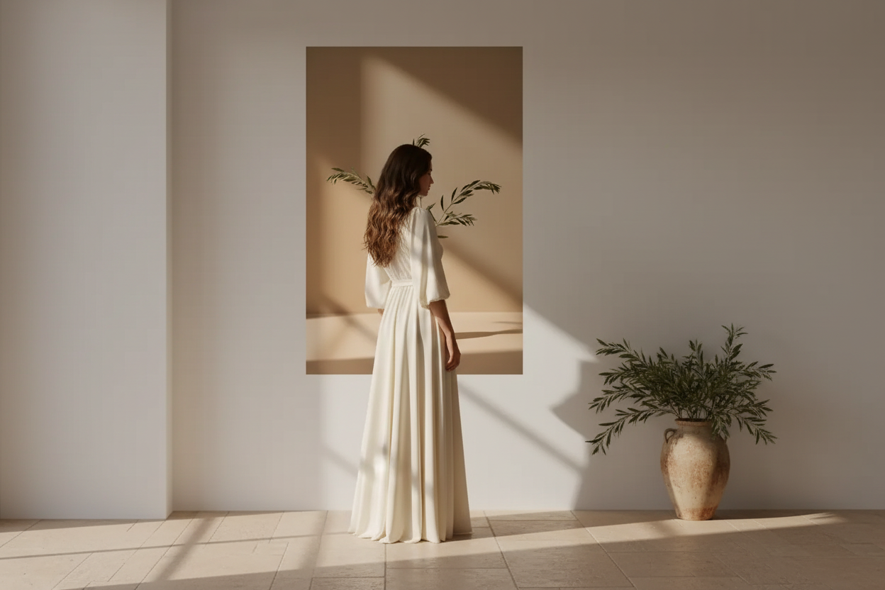
Absolutely. They share the same earthy palette and love of natural materials. A Mediterranean base — terracotta, olive, linen — naturally leans toward boho chic.
Which wall poster to choose for a boho chic interior?
Favor posters with organic patterns and earthy tones: foliage, abstract faces, mineral compositions. Avoid overly geometric patterns or colors that are too bright, which contradict the style’s natural spirit.
Can you do boho chic in a small space?
Yes, provided you select even more carefully. In a small space, one strong poster, a few natural textures, and a tight palette are enough to create the atmosphere without overwhelming the room.
To stay on trend, also discover our Mediterranean decor trends 2026.

Leave a comment
This site is protected by hCaptcha and the hCaptcha Privacy Policy and Terms of Service apply.