

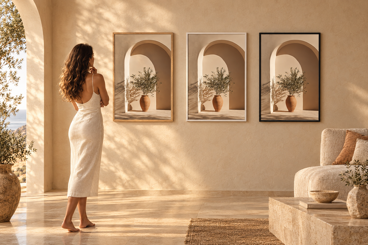
Black, white or oak frame: which colour for a wall art print?
You have chosen the print. One question remains, and it is rarely asked early enough: black, white or oak frame? At Cassili-home, all three cost exactly the same. The choice is therefore not a budget question — it is an architectural one. Here is how to decide based on your wall, not on your print.
Reading time: 6 min
The rule nobody states: the frame does not match the print
This is the most common mistake. You look at the print, pick out a dominant colour, and look for a frame that "goes with it". The result: a frame that melts into the image and disappears, or one that competes with it.
A frame has another job. It separates the print from the wall. It creates a clean boundary between the artwork and the space around it. So it is the wall — its colour, its light, what sits below it — that decides, not the print.
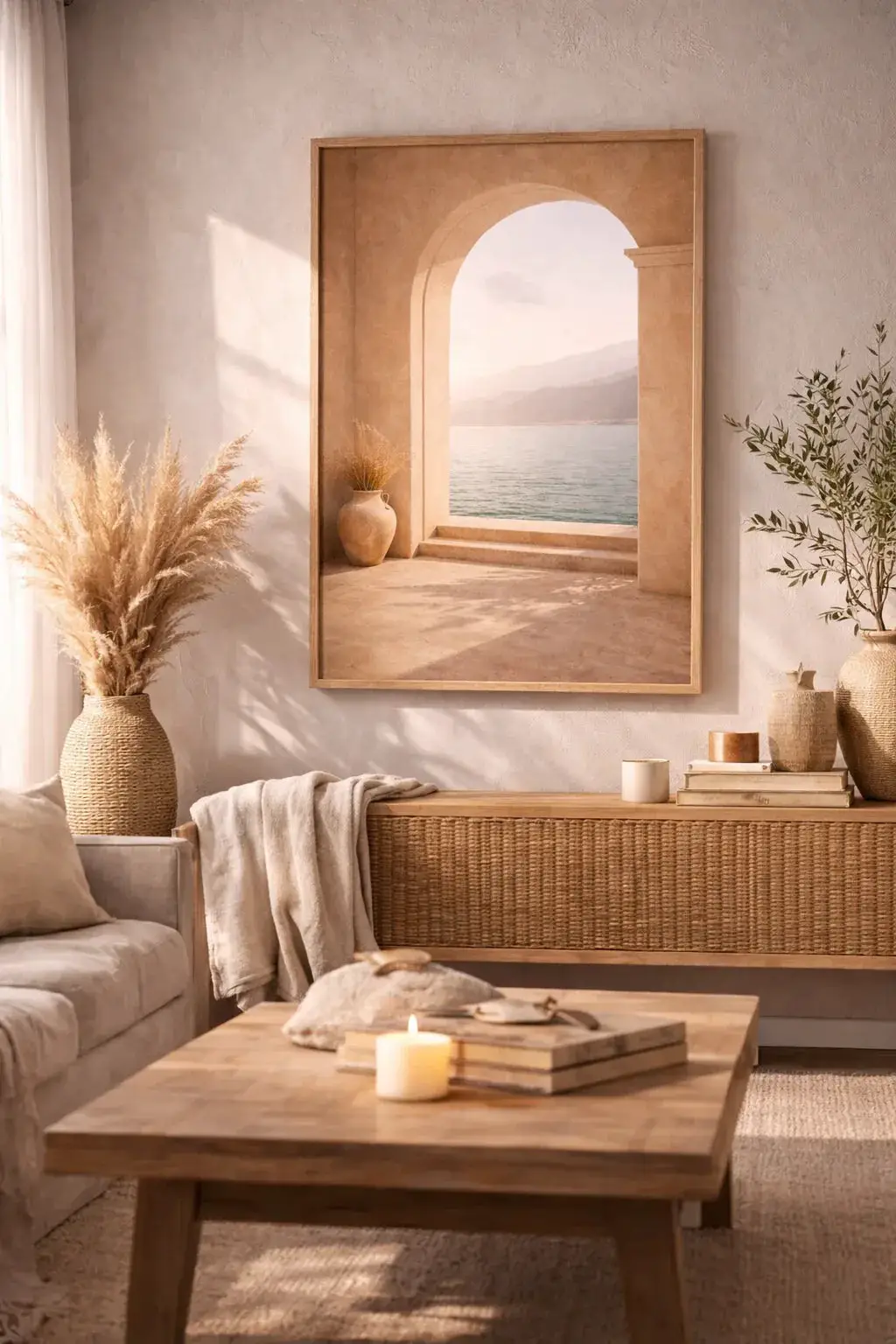
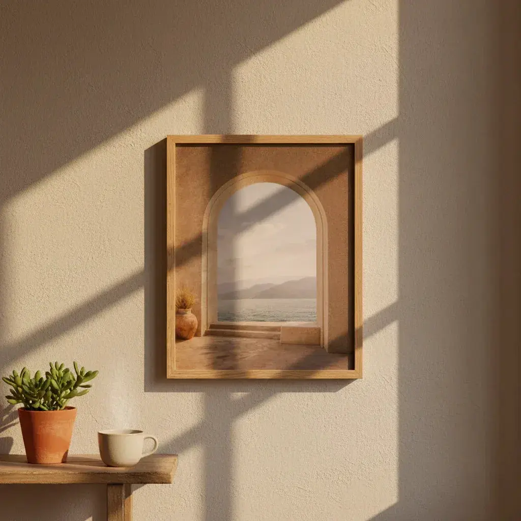
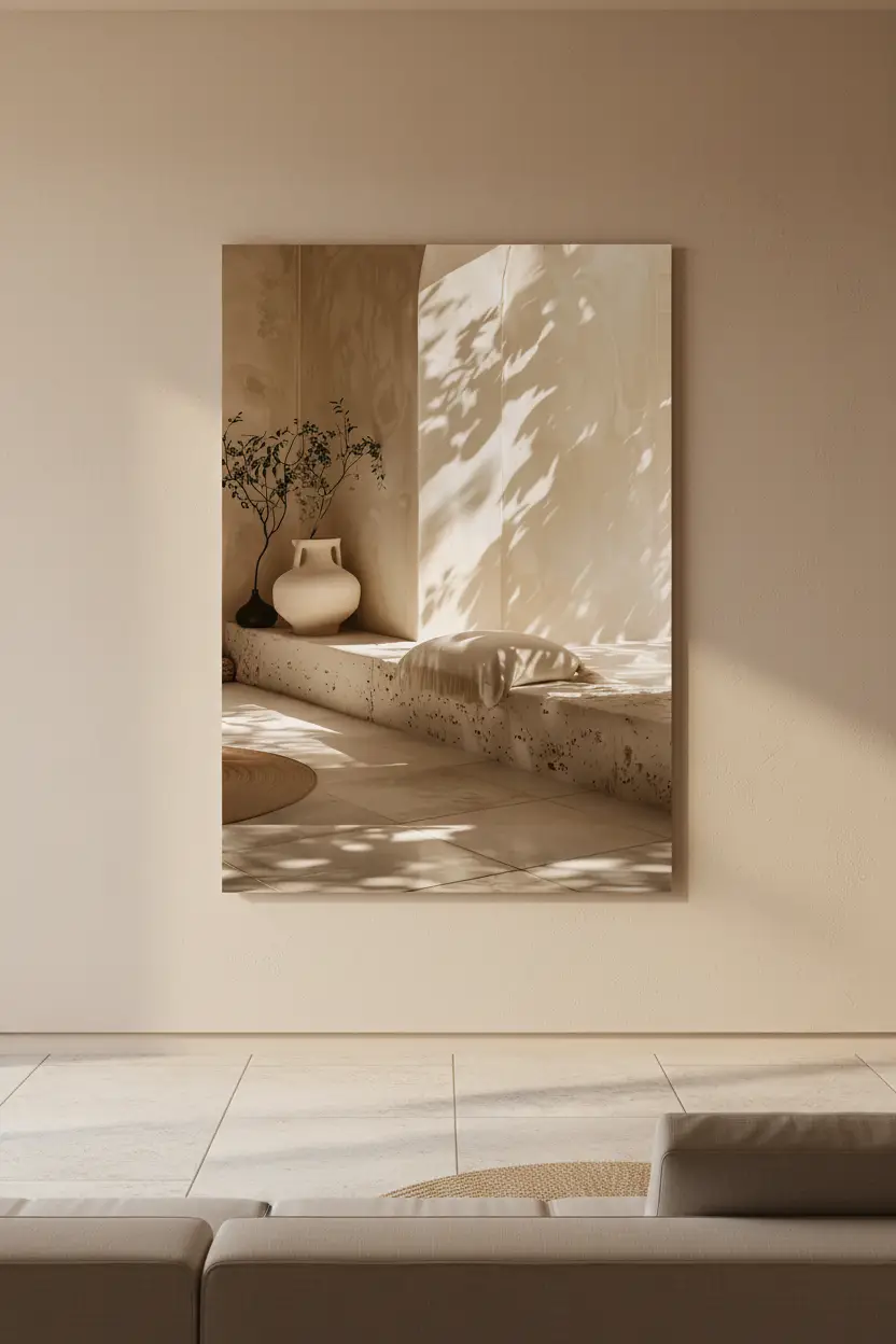
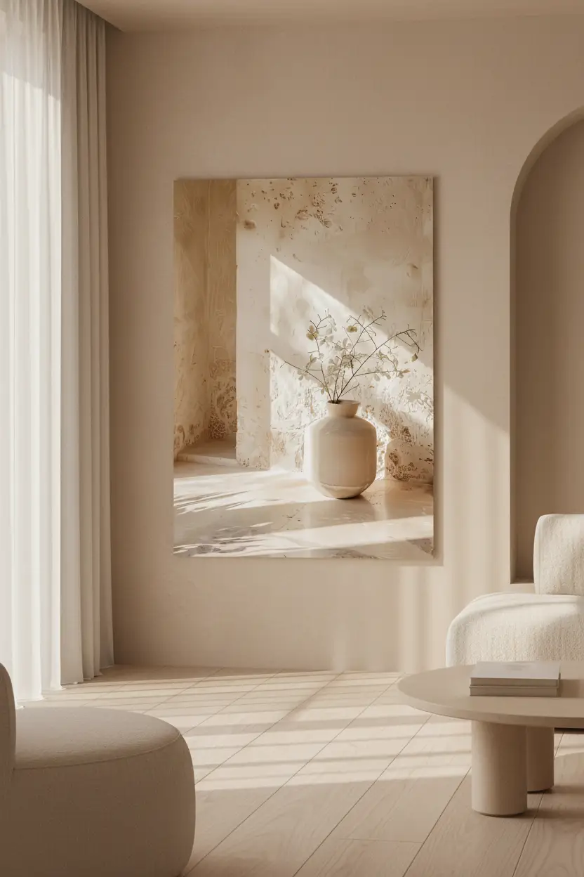
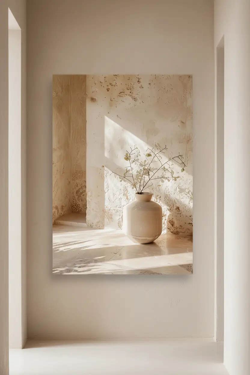
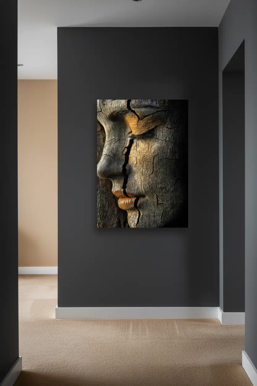
A practical consequence: you can change the print without changing the frame, provided you chose the frame for the room. The three photographs below show the same print, in three frames and three different rooms.

Oak frame: the default choice on pale walls
The oak frame is the easiest to get right in a Mediterranean interior, for a simple reason: pale wood and the sand, ivory and terracotta tones belong to the same chromatic family. The frame extends the print instead of interrupting it.
It works particularly well on an off-white, beige or sand wall, in a room that already has wood in it — a table, a shelf, a wooden floor, a bed. The oak talks to that wood and the whole thing holds together. That is exactly what the photograph above does: the frame picks up the tone of the table.
Its limits: on a very dark wall, pale oak stands out like an object placed there. And in a room where all the woods are dark (walnut, wenge), it creates a mismatch.
→ See the Minéral collection and the Végétal collection, the most natural alongside oak.

Black frame: structure, contrast, precision
The black frame does something the other two do not: it imposes a geometry. On a pale wall, it draws a crisp rectangle that orders the space. It is the frame of contemporary interiors, of dense gallery walls, of rooms where you want rigour.
It is formidably effective in two cases. First on high-contrast prints — dark arches, cast shadows, silhouettes — where it extends the black of the image. Then in a room that already has black metal in it: a light fitting, handles, a steel-framed partition, shelving uprights. The black frame then serves a coherence that already exists.
Its limits: on a wall that is itself dark, it fades away. And in a composition of several prints it quickly becomes heavy — beyond three black frames side by side, the wall turns hard.
→ See the Architecture collection and the Présences collection, which carry black best.

White frame: discretion, and coloured walls
The white frame is the least noticed of the three, and that is exactly what is asked of it. It creates a margin of breathing space between the print and the wall without adding anything.
It is the frame to choose when the wall is coloured — terracotta, olive green, deep blue, ochre. White cuts the print cleanly out of the colour, where oak would blur and black would create a blot. It is also the right choice in a child's room, a bathroom, a very bright room where you are looking for lightness.
Its limits: on a white wall, you have to commit. A white frame on a white wall does not disappear entirely — it creates a slight relief that works if the room is pared back, and looks blurred if the room is busy.
→ See the Lumière collection and the Souffle collection.

The decision table, by wall
| Your wall | Recommended frame | Why |
|---|---|---|
| Off-white, beige, sand | Oak | Chromatic continuity, warmth |
| Pure white, pared-back interior | Black | Structure, graphic precision |
| Terracotta, ochre, olive green | White | Clean cut against the colour |
| Grey, charcoal | White or oak | Black fades there |
| Wall with a lot of wood around it | Oak | Dialogue with the existing wood |
| Wall with black metal (partition, light fitting) | Black | Coherence with the metal |
And for a gallery wall?
One rule, and it is strict: a single frame colour per composition. Mixing black and oak on the same wall produces a disorder that neither spacing nor alignment can rescue.
If you want variation, play on formats and on alternating bare posters with framed prints, not on frame colour. One large framed print as a central anchor, surrounded by smaller flush posters, creates a clean hierarchy.
→ Our full method: choosing three prints that work together and composing a beige gallery wall.
Prices: identical across the three colours
This simplifies the decision. Whichever colour you choose, the framed print costs the same:
| Format | Poster only | Framed (black, white or oak) |
|---|---|---|
| 30 × 40 cm | €39 | €89 |
| A2 (42 × 59.4 cm) | €49 | €119 |
| 50 × 70 cm | €59 | €179 |
| A1 (59.4 × 84.1 cm) | €99 | €199 |
| 61 × 91 cm | €119 | €219 |
| 70 × 100 cm | €139 | — |
The 70 × 100 cm exists as a poster only: beyond 61 × 91, framing becomes too heavy to ship without risk. For a very large format, the flush poster or local framing remain the right options.
Every framed print arrives ready to hang, with protective acrylic glass and hanging hardware included. The framed print is on 170 g/m² matte paper; the poster on its own, on thick matte paper, 189 g/m², 94% opacity.
Cassili-home
The same print, in all three frames
 Oak frame30 × 40 cm · €89View the print →
 White frame30 × 40 cm · €89View the print →
 Black frame30 × 40 cm · €89View the print →
Delivered ready to hang, printed to order, with you in 7 to 10 days.
Discover our Mediterranean wall art prints →
When to take the poster rather than the framed print
Three situations where the bare poster is the better choice. When you are testing a print in a room before committing. When the format is very large and visual impact matters more than finish. And when you already have frames at home, or a local framer you trust.
For everything else — and above all for a gift — the framed print wins: it arrives mounted, protected, ready to hang.
→ The detailed comparison: framed print or poster, how to choose.
The mistakes to avoid
- Choosing the frame from the print instead of the wall — the frame disappears or competes with the image.
- Mixing two frame colours in a single wall composition — the effect is messy.
- Black on a dark wall, or pale oak on a charcoal wall — the frame fades or jars.
- Forgetting what is around the wall — the woods, the metals and the textiles of the room count as much as the paint.
- Three black frames in a narrow hallway — the wall becomes a grid.
FAQ — Which frame colour to choose?
Which frame colour for a beige or sand print?
Oak if the wall is pale and there is wood in the room. Black if the wall is pure white and you want structure. White if the wall is itself coloured. The colour of the print does not enter into the decision.
Does a black frame make a room look smaller?
No, but it densifies the wall. On a large clear wall it structures; in a narrow hallway or a small room that is already busy, it weighs. Prefer white or oak in that case.
Can you mix oak and black frames at home?
In different rooms, yes, with no difficulty. On the same wall or in the same composition, no — the effect is messy.
Do the three frame colours cost the same?
Yes. At Cassili-home, black, white and oak are the same price at equal format. The choice is purely aesthetic.
Does the frame come with the hanging system?
Yes, every framed print arrives ready to hang, with protective acrylic glass and hanging hardware included.
→ All our wall art prints
→ Living room · Bedroom · Entryway · Office




Leave a comment
This site is protected by hCaptcha and the hCaptcha Privacy Policy and Terms of Service apply.