

Terracotta and pale oak: a framed print in an Andalusian house
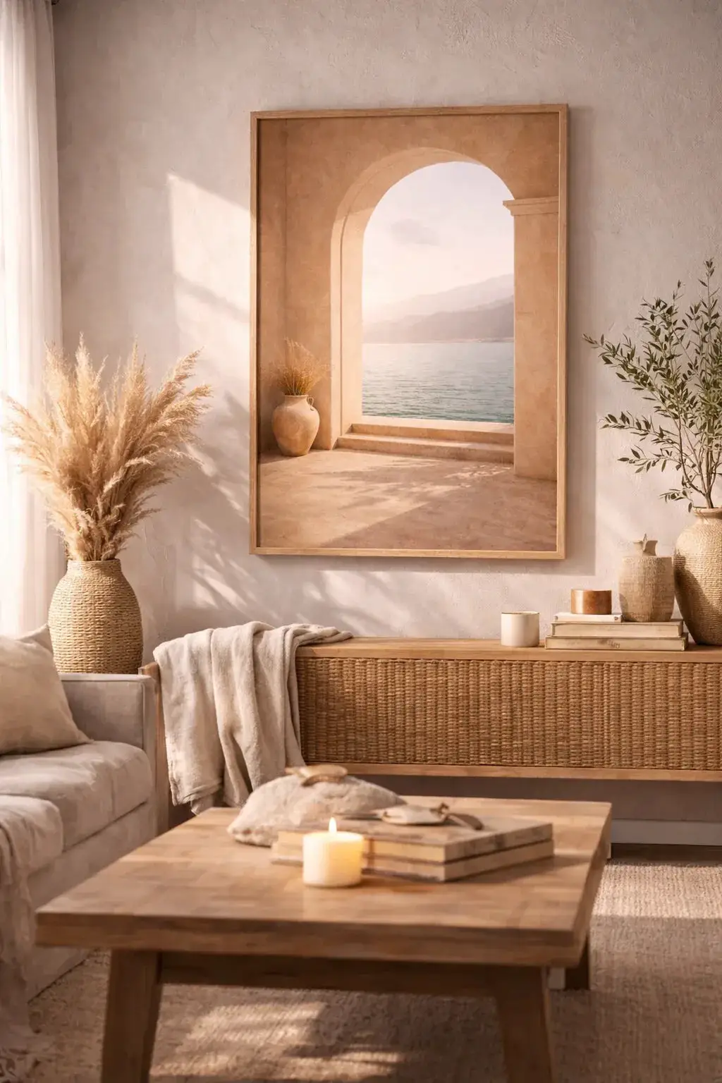
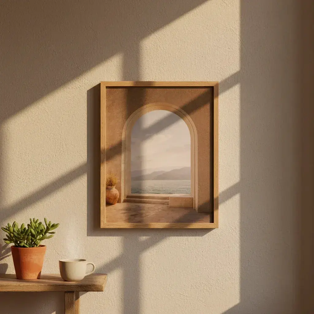
The parcel arrived on a Tuesday, near Málaga. Le Repos du Vase, A1 format, solid oak frame. No studio, no catalogue white wall: an Andalusian house with a terracotta floor, dark wooden doors and light that comes in low at the end of the day.
The photographs that follow are by Kara Da Costa, photographer and content creator in Málaga. She received the print, unwrapped it, and carried it around the house before deciding where it would go. That is exactly the moment you see here — not the finished wall, the search for the right place. It is often the more instructive one.

Pale oak on terracotta
This is the first pairing, and it happens at floor level. Spanish terracotta leans towards burnt orange; pale oak stays a soft yellow. Two warm tones, but separated by enough lightness not to blur into each other — the frame doesn't vanish into the floor, it sits on it.
That is why oak works better than a black frame in these interiors. Black cuts, outlines, brings the eye back to the edge. Oak lets you look at the image.

A pale wall, and everything settles
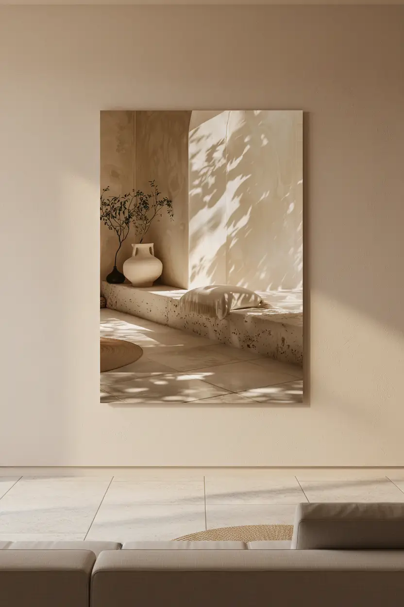
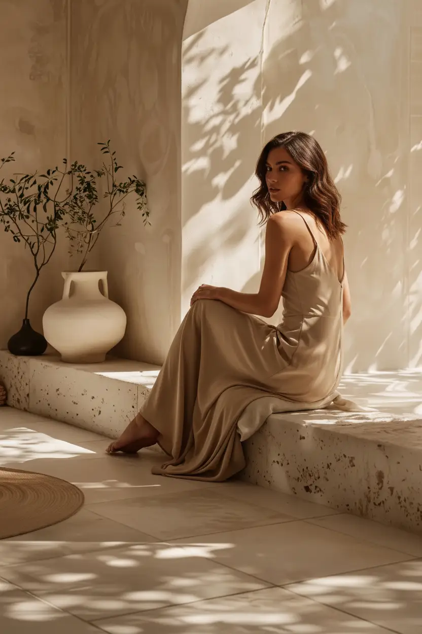
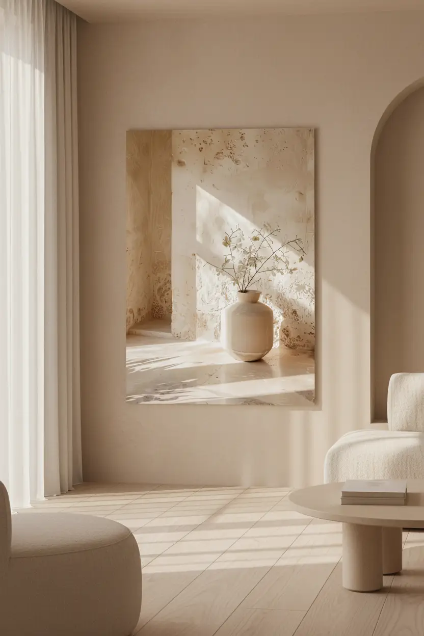
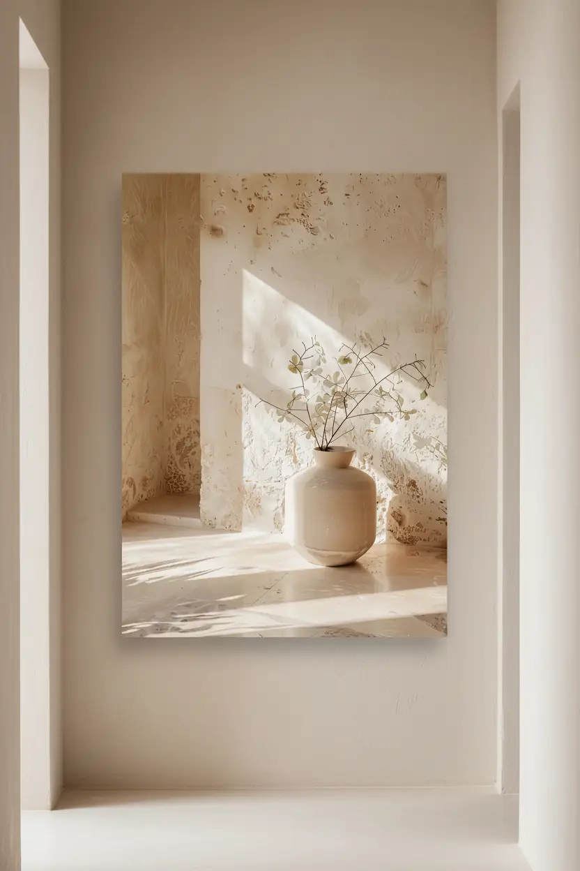
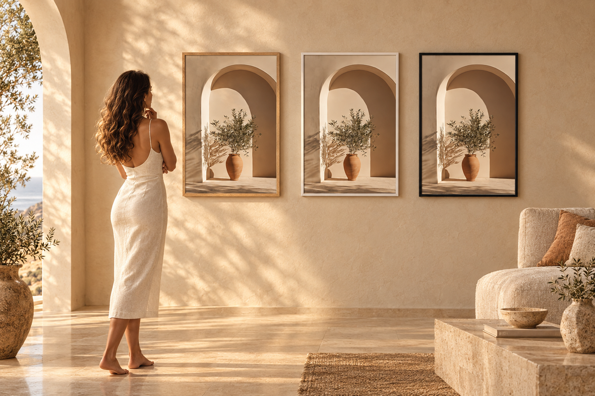
Second attempt, against a white wall. The print shows a stone niche with a vase and dried branches — beige, sand, very soft ochre. On a pale wall the subject carries the colour, and the frame simply holds it.
This is the safest placement: if you're hesitating, a pale wall will never let you down.

Dark wood: the real test
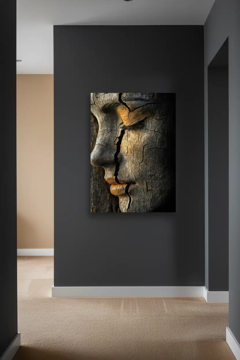
Set against an antique cabinet in dark wood, the framed print could easily have been swallowed. It holds its own, for one precise reason: the pale oak makes the transition. Without it, the beige of the paper and the brown of the cabinet would meet with no room to breathe.
This is the case where a mount would also have worked — but the pale frame does the same job with less material.

On a terracotta wall
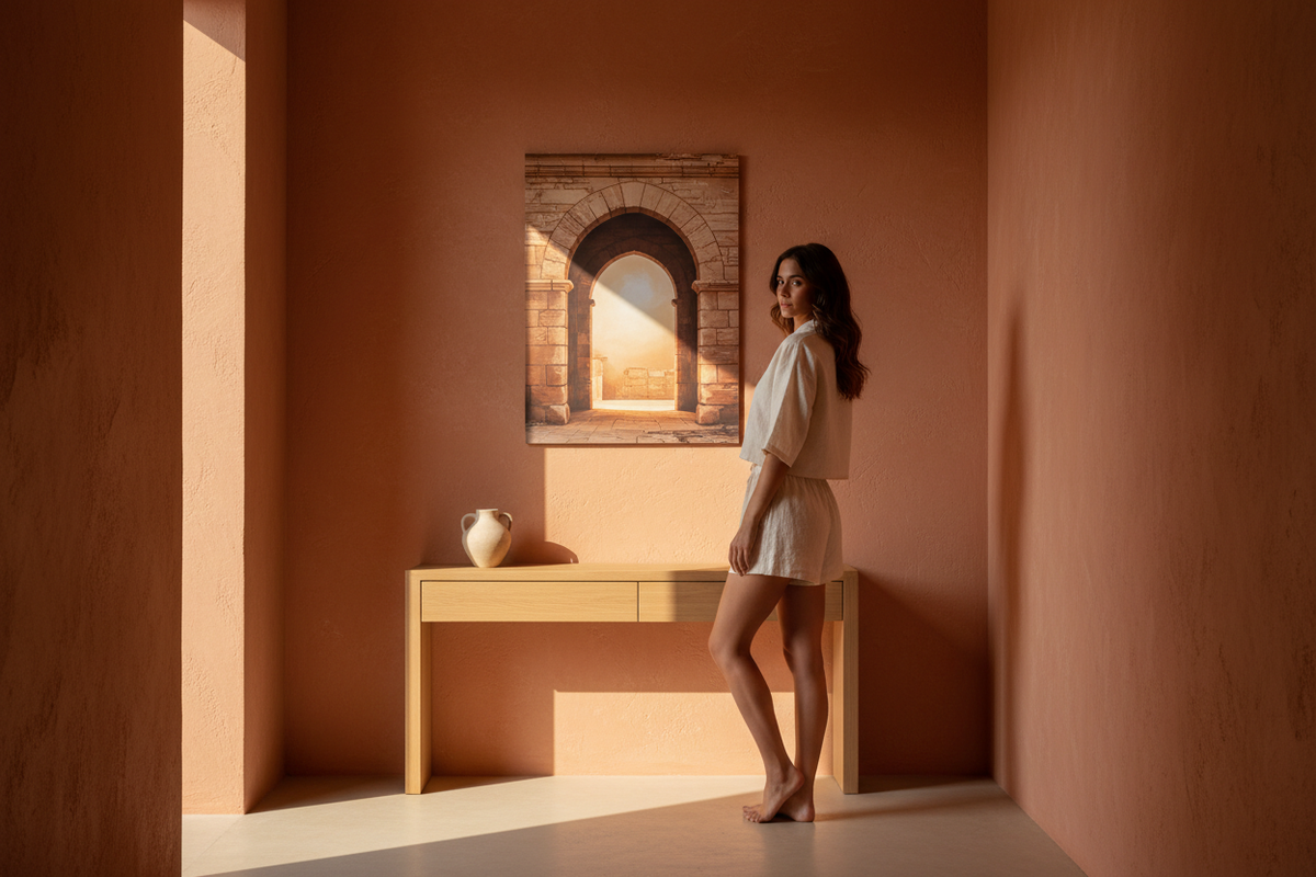
The hardest wall in the house, and the most beautiful. Saturated terracotta, solid wood door, black ironwork. The print becomes a window there: it opens a pale space in the middle of a wall that closes in.
That's the principle to remember for a strongly coloured wall — a pale image always gains, a dark one drowns.

The size does the rest
One thing these photographs make obvious: A1 (59 × 84 cm) isn't a large format, it's the first format that stands on its own. Below that, a print needs a piece of furniture or a second print to exist. From A1 up it is sufficient in itself — and that is what lets you carry it from wall to wall the way Kara did, without it looking lost anywhere.
Thank you, Kara
These photographs are by Kara Da Costa, photographer and content creator in Málaga. She chose the room, the print and the way to photograph it — I directed none of it, and that is precisely what gives these images their value. Thank you for that eye.
If these images speak to you, the rest of her work is well worth the detour: interiors, lifestyle, fashion. Discover and follow her at karadacosta.com.
Discover Le Repos du Vase · The oak frame option · All our wall art posters


Leave a comment
This site is protected by hCaptcha and the hCaptcha Privacy Policy and Terms of Service apply.