
Wabi-sabi: Elevate imperfection through wall art
Wabi-sabi is not just a decor trend: it is an ancient Japanese philosophy that celebrates the beauty of imperfection, wear, and the passage of time. When applied indoors, it creates calm, authentic, and deeply human spaces. Here’s how the wabi-sabi spirit expresses itself, especially through wall art.
The Wabi-Sabi Philosophy
Wabi-sabi finds beauty in what is modest, imperfect, and impermanent. A cracked and then repaired pottery, a patina, an asymmetry: these are traces of time that wabi-sabi does not seek to hide but to honor. It is an invitation to slow down and prefer the authentic over the perfect.
Wabi-Sabi in Decoration
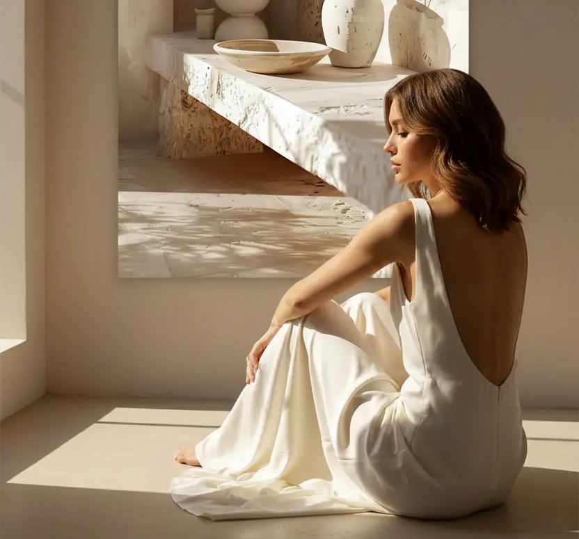
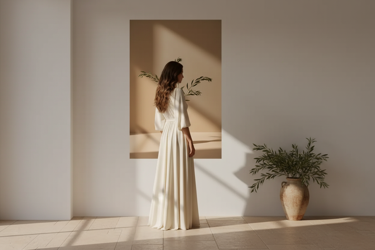
Practically, a wabi-sabi interior favors raw and living materials: untreated wood, crumpled linen, stone, clay, lime plaster. The colors are natural and muted — beige, taupe, gray, earth tones. Irregularity is accepted, and overly smooth or new surfaces are avoided. Every object tells a story.

The Imperfect Poster: Textures and Nuances
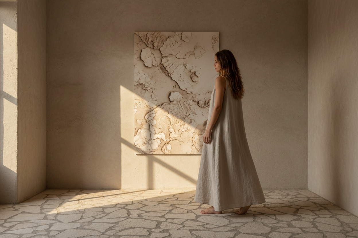
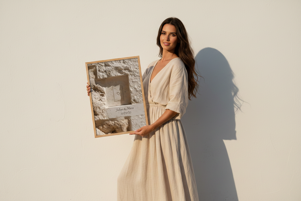
In wall art, the wabi-sabi spirit is expressed through textured and nuanced visuals rather than sharp and graphic ones: a mineral composition, a surface of plaster or travertin, an irregular sandy gradient. The poster becomes a material in its own right, with its shadows and roughness. Our beige and sand posters particularly embody this sensitivity.

Wabi-Sabi and Japandi
Wabi-sabi directly inspires the Japandi style, which embraces the love of raw materials and simplicity, adding Scandinavian structure. If Japandi is the aesthetic, wabi-sabi is its soul.

Mistakes to Avoid
- Too much decoration — wabi-sabi is a chosen simplicity. Too many objects or posters break the serenity of the whole.
- Finishes that are too perfect — avoid shiny surfaces, elaborate gold frames, or synthetic materials that betray the raw spirit.
- Colors that are too bright — wabi-sabi lives in muted and natural tones. A poster with saturated colors immediately disrupts the harmony.
- Confusing wabi-sabi with neglect — imperfection is chosen and carefully highlighted, never endured. The space remains intentional and uncluttered.
Discover our textured posters →

FAQ — Wabi-Sabi Decor
Is wabi-sabi a “neglected” interior?
No. Wabi-sabi is not disorder: it is a chosen simplicity where imperfection is carefully highlighted. The space remains uncluttered, calm, and intentional.
What colors suit a wabi-sabi interior?
Natural and muted shades: beige, sand, taupe, gray, earth tones. Bright colors and shiny finishes are avoided in favor of matte tones and living materials.
Which wall poster to choose for a wabi-sabi interior?
Choose posters with natural textures and muted tones: mineral compositions, travertin, sand, clay. Avoid overly sharp patterns or bright colors that contradict the authentic spirit of wabi-sabi.
Wabi-sabi and Japandi, what’s the difference?
Japandi is a decorative style that blends Japanese and Scandinavian aesthetics. Wabi-sabi is its underlying philosophy: the love of imperfection and impermanence. You can have a Japandi interior without being wabi-sabi, but wabi-sabi always nourishes the most authentic Japandi.

Leave a comment
This site is protected by hCaptcha and the hCaptcha Privacy Policy and Terms of Service apply.