
Article: Decorating a staircase wall: which prints to choose for your stairs
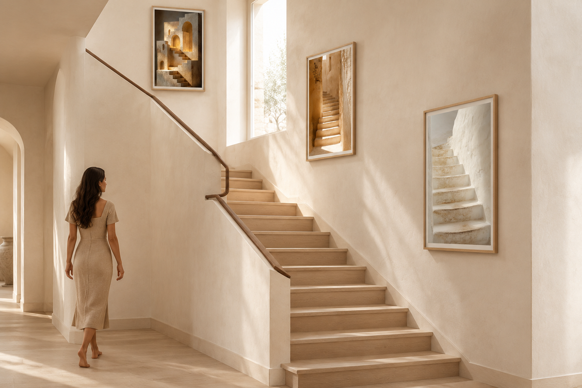
Decorating a staircase wall: which prints to choose for your stairs
The staircase wall is the largest empty wall in the house, and the one most often forgotten. You walk past it ten times a day without ever stopping. Yet, well dressed, it becomes a gallery you pass through slowly — provided you respect what sets it apart from every other wall: you never look at it head-on, and never standing still.
Why a staircase wall is unlike any other
A living room wall is viewed seated, from a distance, head-on. A staircase wall is viewed on the move, at an angle, and from a height that changes with every step. Going up, you look up at it; coming down, you look down on it. That is why the usual rules no longer apply: a print hung “at eye level” as seen from the ground floor is too low for someone halfway up.
It also has a light of its own, often falling from above or grazing the wall, coming from a landing window or a ceiling light. It picks out every relief and makes glossy surfaces shine: one more reason to choose matte paper.

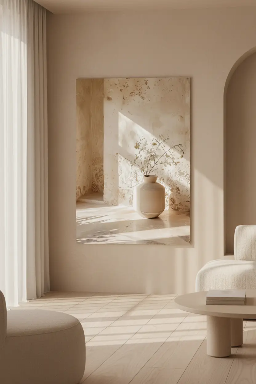
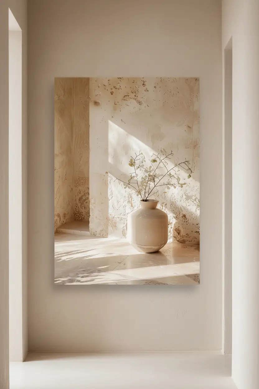
The Limewashed Staircase — from 39 €
One large print or a series?
It all depends on the length of the climb. On a short staircase, or when the wall only really comes into view as you arrive, a single large print works better than a series: it gives the eye a destination and doesn't break up a wall that is already narrow.
On a straight flight rising a full storey, a series is the obvious choice. Three prints of the same size, set on a diagonal along the slope, keep pace with your steps and turn a passageway into a journey. Beyond three, stick to a single size: elegance comes from regularity, not from numbers.
Following the slope: the method
The rule fits in a single sentence: each frame is measured from the step directly beneath it. The centre of the print sits 145 to 150 cm above the nosing of that step — the same height as in the rest of the house, simply measured from the step rather than from the floor.
Repeat this measurement for each frame and you naturally get a line parallel to the handrail. Keep a constant gap of 5 to 8 cm between the frames, as recommended in our hanging guide, and always start with the middle print: it sets the line, and the other two align with it.
Before drilling, cut kraft-paper templates to the size of your frames and fix them in place with masking tape. Walk up and down the stairs two or three times: a staircase wall can only be judged on the move.

The Chalk Steps — from 39 €
Turning, quarter-turn and spiral staircases
On a turning staircase, hang your prints on the outer wall of the curve, the longest and most visible one. The frames follow the turn, each measured from its own step, and the curve becomes a stroll.
A quarter-turn staircase comes with a gift: the wall of the half landing, which faces you all the way up the first flight. It is the place for a centrepiece, on its own, in a large format.
A spiral staircase, on the other hand, leaves little flat surface. Better a single print at the foot of the stairs, where people pause, than a series of small frames that wind round with the spiral and are never seen as a whole.

The Curved Staircase — from 39 €
The landing and the end wall: the point of arrival
The wall that faces you as you climb is the most looked-at wall of the whole staircase, and it is seen from afar. This is where a large format comes into its own: an A1 or a 61 × 91 cm print reads from the very first step and gives the climb a destination. Our large-format selection brings together the prints that hold their own at that distance.
Leave breathing room around it: a single piece, centred on the wall, with nothing else. A cluttered landing is something you hurry through; a landing dressed with a single image invites you to slow down.

The Golden Ascent — from 39 €
Which subjects suit a staircase
The most fitting choice is often the most literal: a staircase on the staircase. A receding perspective of steps visually extends the climb and gives depth to a flat wall. Arches and passageways have the same effect — an opening where there is none.
Think, too, about how the image reads at an angle. As in a hallway, prints on a staircase are seen from the side and up close. Broad shapes — steps, arches, flat planes of light — stand up to this glancing view; fine details, text and dense patterns get lost.
Finally, the palette: a staircase rarely gets enough light. Pale tones — ivory, lime, sand, stone — brighten it, whereas dark prints close it in. Our entire Architecture collection plays on these tones.

The Impossible Staircase — from 39 €
Cassili-home
Three prints designed for a staircase
 The Limewashed StaircaseMatte paper · from 39 €View the print →
 The Chalk StepsMatte paper · from 39 €View the print →
 The Impossible StaircaseMatte paper · from 39 €View the print →
Printed to order, delivered ready to hang within 7 to 10 days.
Framed print or poster?
On a staircase, a frame is not a luxury. You go up and down with your arms full — a bag, a laundry basket, a child — and you brush against the walls. A frame protects the edges of the paper and gives the series a clean line, which is essential when the prints follow a diagonal.
For the colour, look at the staircase itself: oak goes with wooden treads, white with limewashed walls and pale stone stairs, black with a metal handrail. For a series, one frame colour, without exception.

The Silver Olive Tree — from 39 €
Mistakes to avoid
Lining the frames up horizontally above the stairs: the line cuts across the slope instead of following it, and the lowest frames end up at knee height. Measuring from the ground floor rather than from the step. Scattering small prints of different sizes across a wall people walk past quickly. And forgetting the handrail: leave at least twenty centimetres or so between the bottom of the frames and the rail, so that hands don't knock against them.
In short
A staircase wall is seen on the move: each frame is measured from its own step, 145 to 150 cm above the nosing, and the whole arrangement follows the slope. A series in a single size for a long flight, one large piece for the landing, broad subjects and pale tones for a space that is often dark. Find our full selection on the staircase wall art page, and to plan your series before you buy, try our gallery wall configurator. If your staircase opens onto the entrance hall, our entryway wall art guide takes the idea further.
FAQ — Decorating a staircase wall
How high should you hang wall art on a staircase?
Measure from the step directly below the frame, not from the ground floor: the centre of the print sits 145 to 150 cm above the nosing of that step. Repeat the measurement for each frame and you automatically get a line parallel to the slope.
How many prints for a staircase?
For a straight staircase rising one storey, three prints of the same size are enough, or a single large piece on the landing wall. Beyond that, what matters is no longer the number but the regularity: same size, same spacing, same line.
What size should you choose for a staircase wall?
50 × 70 cm and A2 suit a series running up the stairs. The landing wall or the end wall can take a large format, A1 or 61 × 91 cm, because it is seen from afar as you climb.
Should prints on a staircase be framed?
It is recommended: a staircase is a place people pass through, brushing the walls with a bag or a laundry basket. A frame protects the edges and gives the arrangement a clean line. Oak goes with wooden treads, white with limewashed walls, black with metal handrails.


Leave a comment
This site is protected by hCaptcha and the hCaptcha Privacy Policy and Terms of Service apply.