
How to Choose Your Wall Art According to the Room | Cassili-home
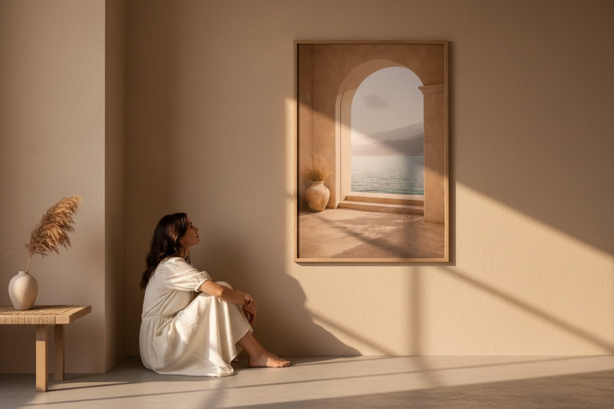
Some walls are waiting. Not to be filled — to be revealed. Choosing a wall poster means understanding the light of a room, sensing its rhythm, guessing at what it murmurs. This guide takes you through it room by room.
Three questions to ask before you choose
Before you browse the collections, pause on three questions. They will spare you the most common mistake: choosing a poster for itself, rather than for the wall that will receive it.
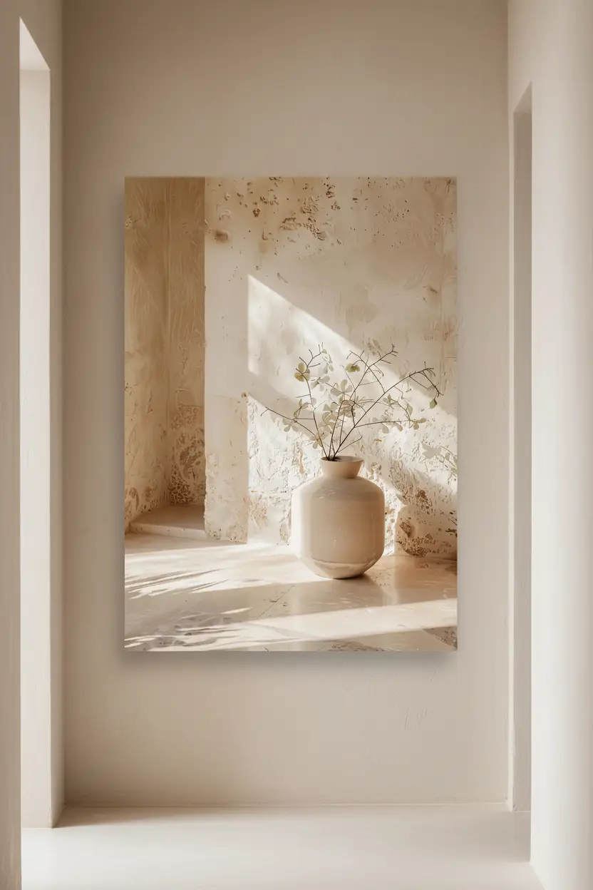
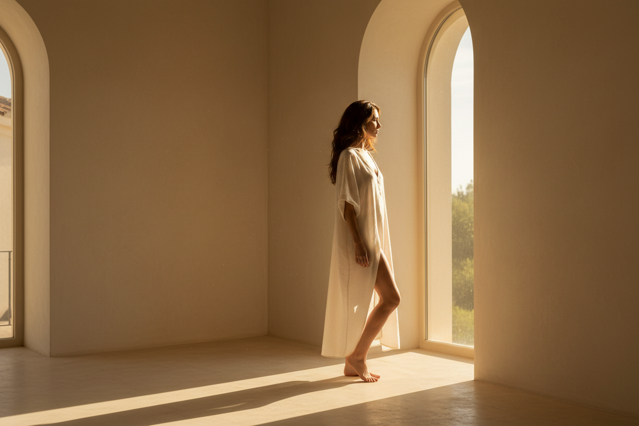
What is the light in the room like? Warm, raking light brings out mineral textures and architectural compositions. Cool, diffuse light calls for softer motifs, botanical or luminous. Observe your wall at different hours before making up your mind.
What is the room for? You do not ask the same thing of a living room poster as of a bedroom poster. The first structures and asserts; the second soothes and envelops. The function of the room dictates the intensity of the motif.
What palette is already there? A successful poster extends the room, it does not contradict it. Identify the two or three dominant shades of your interior — sand, ivory, terracotta, wood — and look for a piece that stays within that chromatic family.
The living room: the art of presence
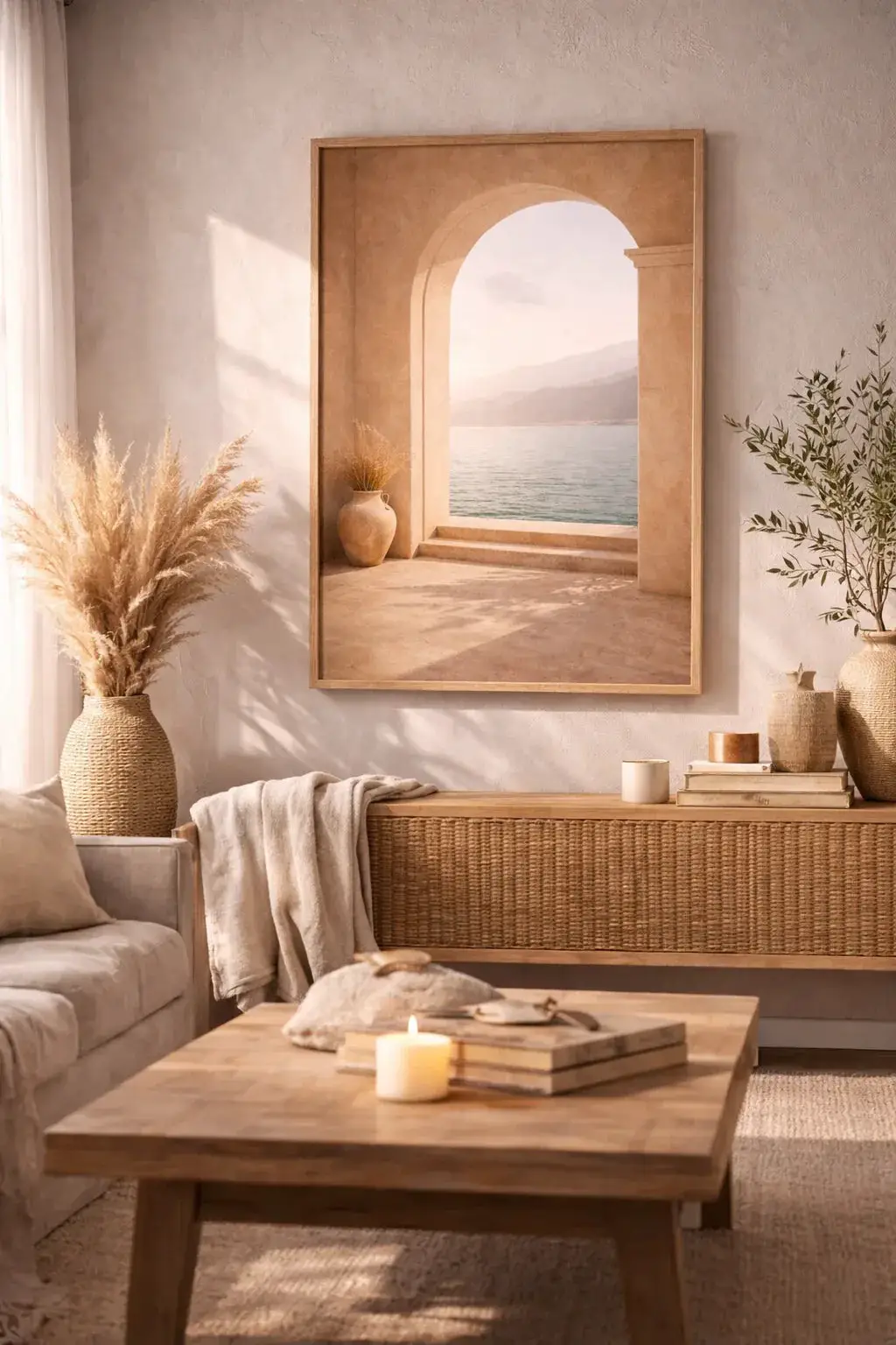
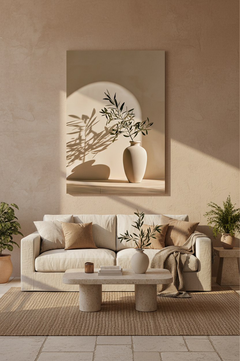
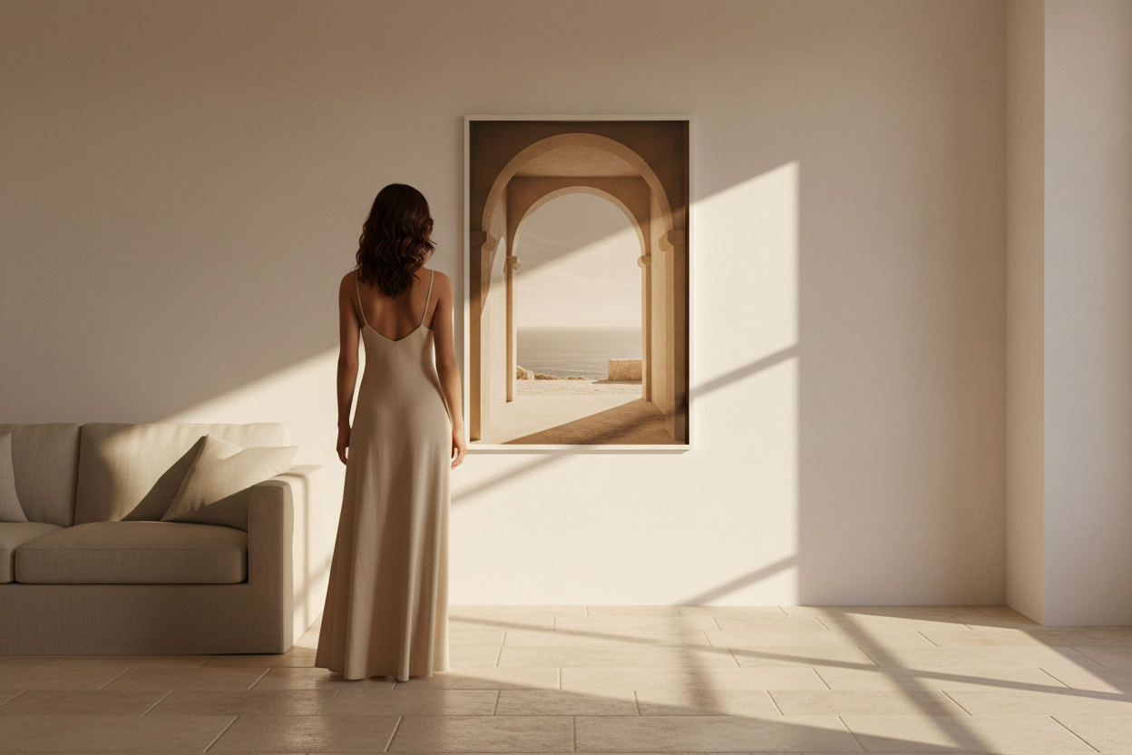
The living room calls for generous sizes — A1 or 50×70 cm. Go for motifs with strong visual impact: pared-back architecture, structured botanical compositions, or mineral abstractions. Discover our Architecture collection and our Minéral collection. Read our guide to the modern Mediterranean living room.

The bedroom: intimacy above all
The bedroom calls for pieces that soothe. Favour soft, organic motifs — delicate plants, linen textures, raking light. A2 or 50×70 cm sizes above the headboard create a balanced composition. The Lumière collection and the Végétal collection are particularly well suited. Have a look too at our article on how to compose an elegant gallery wall.

The office: concentration and inspiration
The workspace deserves particular attention. Go for pared-back, geometric or architectural compositions, in medium sizes — 30×40 or A2. Our Minéral collection and the Présences collection offer ideal pieces. To go further, read our guide to choosing the right minimalist wall poster.

The entrance: the first impression
The entrance is the promise of what follows. Favour vertical posters in a large size, which give height and depth. An architectural motif — a corridor, an arch, a perspective — creates a striking illusion of space. Explore our Architecture collection and read our article on inspirations for an elegant entrance. Read our guide too on how to choose a Mediterranean wall poster.

The rule of proportion: which size for which wall
The right size is not a matter of taste, it is a matter of measurement. The simplest rule: your poster (or your composition) should cover roughly two thirds of the width of the furniture it hangs above. Above a 200 cm sofa, aim for a single A1 or a trio of 50×70 cm.
As for hanging height, place the centre of the piece at eye level, that is roughly 145 to 150 cm from the floor. Above a piece of furniture, leave 20 to 30 cm between the top of the unit and the bottom of the frame. For all the details, see our guide to how to hang a poster.
The classic mistake remains a size that is too small: a 30×40 poster lost above a large sofa will always look timid. When in doubt, think bigger.
Framed or unframed: each room has its own answer
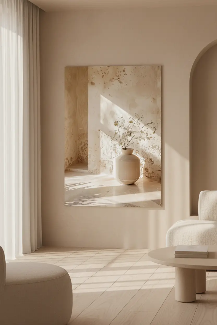
In a minimalist interior, an unframed poster set straight onto the wall gives the most pared-back effect: the image melts into the architecture. A light oak frame, on the other hand, brings warmth and a finished look — ideal in a living room or an entrance, where you are looking for a more assertive presence. In a bedroom or a bathroom, the unframed poster, lighter in feel, is often enough. To help you choose, read our comparison of framed poster or print.
Kitchen, bathroom, hallway: the rooms we forget
Pass-through rooms are often the barest — and therefore the ones where a poster has the greatest effect. In a Mediterranean kitchen, a small mineral or botanical composition warms up a wall between two wall units. In a bathroom, a travertine motif or a stone texture creates a spa atmosphere. And in a narrow hallway, a poster with perspective — an arch, a row of openings — visually widens the passage. Do not neglect them: these are the walls we pass most often.
Frequently asked questions
Which poster for a small space?
In a small room, a single well-chosen poster is worth more than an accumulation. Favour a medium size (30×40 or A2) and a motif with perspective, which creates a sense of depth and enlarges the space.
Can you mix several motifs in the same room?
Yes, provided you keep a common palette. Pair an architectural piece, a mineral composition and a botanical one, for example, as long as they share the same warm tones. It is chromatic coherence that holds the whole together, not uniformity of subject.
Which poster colour for a neutral interior?
Sand, ivory, beige and soft terracotta are the safe choices: they extend a neutral interior without breaking it. Avoid cool greys and stark blacks, which cut through the warmth of a Mediterranean feel.
Every room has its language. Every poster, its answer. Browse the whole of our collection of minimalist wall posters and let yourself be guided by what you feel.




Leave a comment
This site is protected by hCaptcha and the hCaptcha Privacy Policy and Terms of Service apply.