
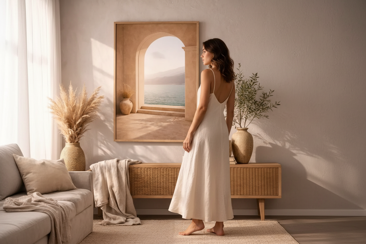
Beige and wood living room: which posters to choose?
Reading time: 7 min
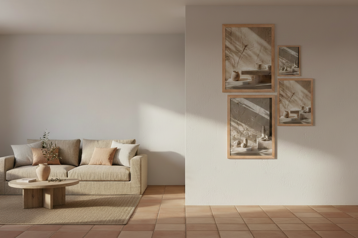
Beige and wood is the easiest pairing in contemporary decorating. It is also the one people get wrong most often — not in the choice of furniture, but in what goes on the wall above it. A living room with sand-coloured walls, an oak sideboard and an ecru sofa already looks finished. You add a poster, and something closes up: the room turns flat, or brown, or vaguely catalogue-like.
The problem is almost never the poster itself. It comes from what nobody looks at: the relationship between the wood of your furniture and the tones of the image. Wood is not a neutral. It has a colour, a warmth, sometimes a pink or greenish cast, and it covers a large surface. Choosing a poster for a beige and wood living room means choosing according to the wood first.
Wood is not a neutral colour, and that is the whole point
Wood gets filed away with beige, linen and stone under the heading of "naturals", as if they formed a homogeneous family. They do not. Light oak and dark walnut do not share the same temperature; set against the same beige wall, they do not call for the same images.
Run a test before you choose anything. Hold a sheet of white paper against the wooden piece that covers the most surface in the room. The white acts as your reference: it makes immediately visible what the wood really leans towards.
- A yellow or honey cast — light oak, beech, pine. Warm, luminous wood that pushes the whole room towards gold.
- A red or orange cast — cherry, teak, some aged oaks. The hardest to match: it competes with terracotta.
- A grey or ashen cast — smoked oak, driftwood, bleached ash. Cold wood, despite appearances.
- A deep brown cast — walnut, wenge. It behaves like a dark colour, not like a neutral.

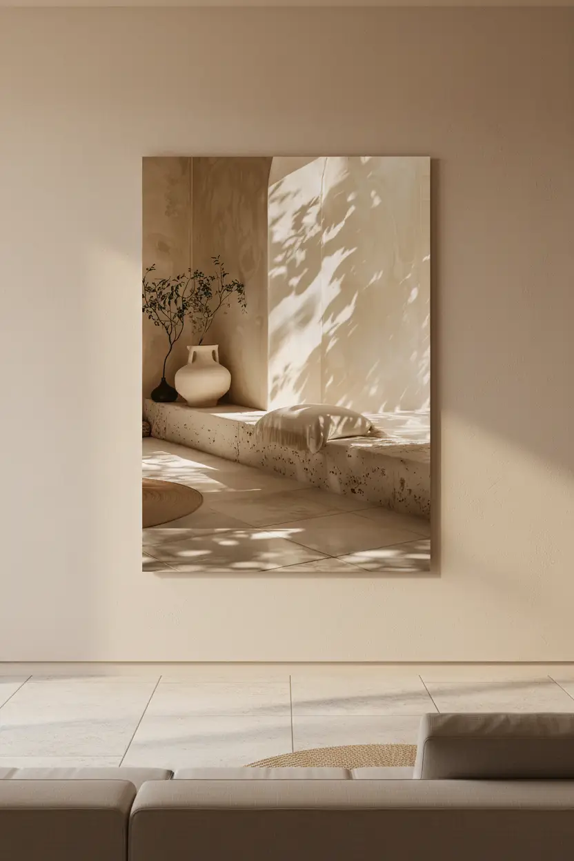
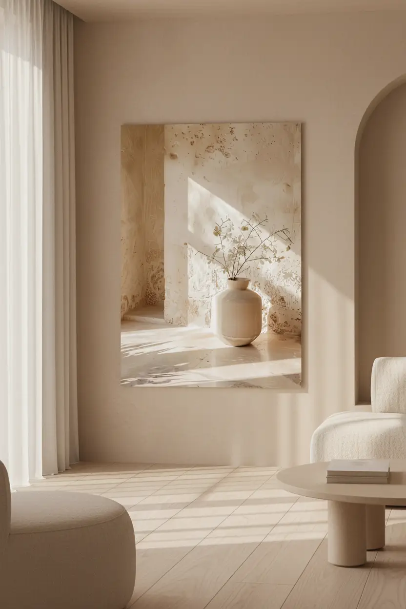
Natural Travertine — mineral texture, the counterpoint to wood
The rule that avoids the mistake: match the temperature, not the shade
The most common error is looking for a poster "in the same colour as the furniture". A poster beige set next to honey oak does not produce harmony: it produces two beiges that are slightly wrong for each other, and the eye sees nothing but the gap.
What has to match is the temperature. Warm wood calls for a poster whose neutrals are warm — sand, ivory, clay, plaster. Ashen wood can take cooler neutrals — grey stone, limewash, bluish shadows. In both cases the poster does not imitate the wood: it lives in the same climate.
A second rule, simpler still: the darker the wood, the lighter the poster has to be. A living room with walnut furniture already has its dark mass. A dark image above it closes the wall; a light one gives it air back.
The frame: extend the wood or neutralise it
This is the decision that changes the result the most, and the one taken the fastest.
A solid oak frame facing light oak furniture creates continuity: the poster stops being an added object and becomes part of the furniture. It is the safest choice in a beige and light wood living room, and it is also the one that ages best.
Facing dark or reddish woods, continuity becomes a trap: a light frame against a walnut piece underlines the gap instead of resolving it. There, the frame has to step back — or the poster do without one. A bare poster on a sand-coloured wall, above a dark sideboard, lets the wall breathe between the two masses.
A third case, often forgotten: rattan and cane. They read as light wood but with a visible weave. A heavily grained frame added on top makes two textures fight each other. Cane calls for smooth surfaces opposite it.

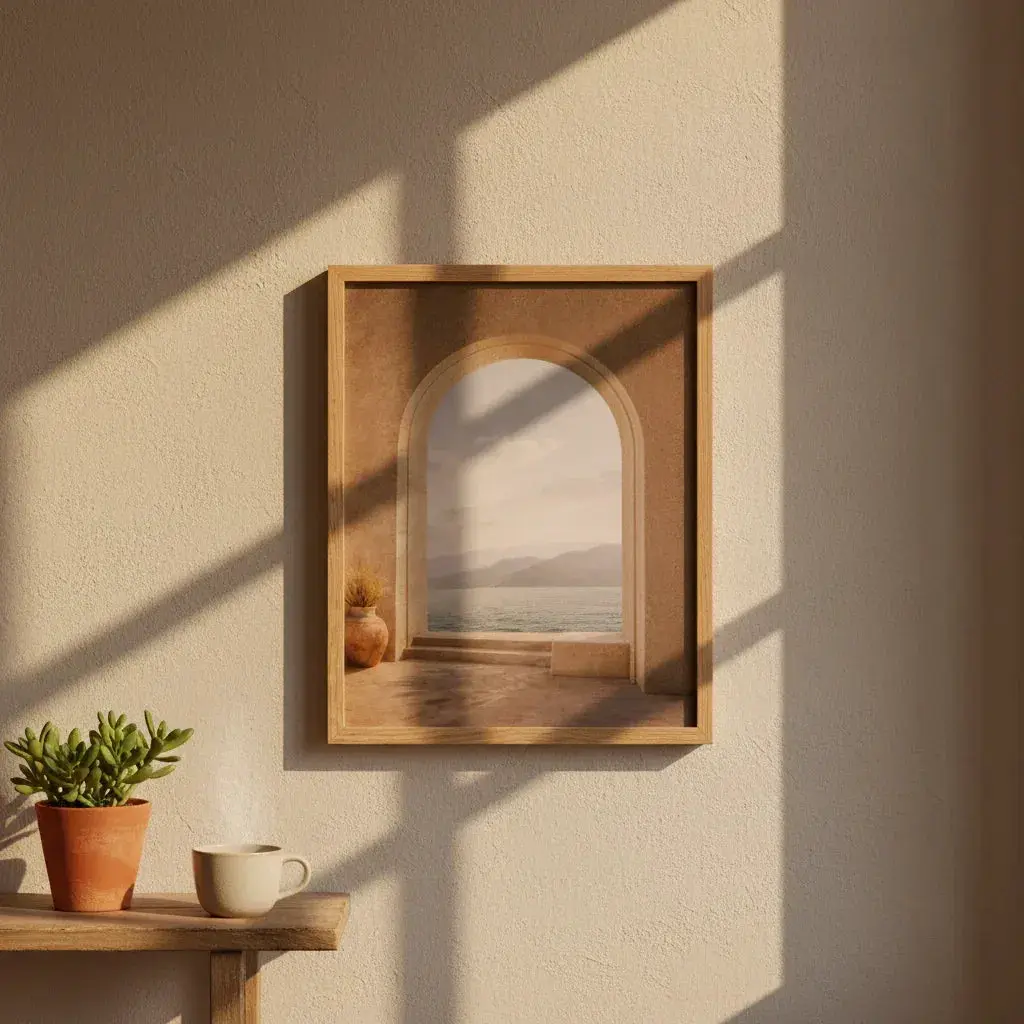
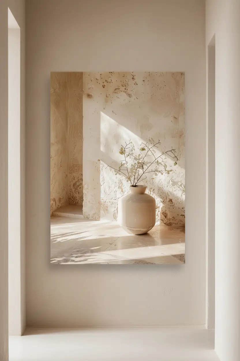
The Rest of the Vase, framed in solid oak — continuity with light wood furniture
Which motifs hold up against wood
Wood already brings texture, line and warmth. A poster that brings all three again saturates the room. The motifs that work are the ones that bring what wood does not have.
- Stone and plaster — travertine, limestone, stucco, lime render. Mineral is what wood is not: cold to the touch, matte, with no directional graining. It is the most reliable counterpoint. See the Minéral collection.
- Architecture and arches — clean lines and flat areas, where wood offers curves and grain. See the Architecture collection.
- Light and shadow — an image built on a cast shadow adds no material, only depth. See the Lumière collection.
- Dried plants — to be handled with care. They belong to the same family as wood; they work when the furniture is light and smooth, less so when it is dark or heavily grained. See the Végétal collection.
The motif to avoid in a room that is already wood: wood imitation. A poster showing wood next to real wood always reads as a failed copy of what stands beside it.

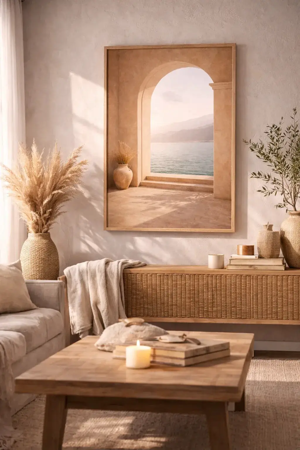
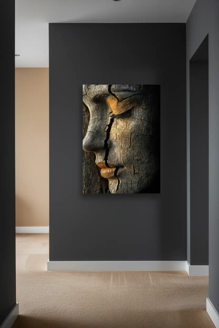
Mediterranean Arch — clean lines and flat areas against the grain of wood
Discover our Mediterranean wall posters →
The case of the sideboard, the credenza and the bookcase
Above a low wooden unit, the poster is not on its own: it forms a block with the furniture. Two guides are enough.
The first is about width. An image clearly narrower than the furniture looks like an object set down crooked; aim for a poster width — or a composition width — close to two thirds of the width of the furniture.
The second is about empty space. Leave a clear gap between the top of the furniture and the bottom of the frame, and keep to it across the whole wall. A constant gap reads as a decision; a variable one reads as an accident.
If the furniture is loaded — objects, vases, books — the poster has to be calmer than usual. A single image, with no multiple composition.

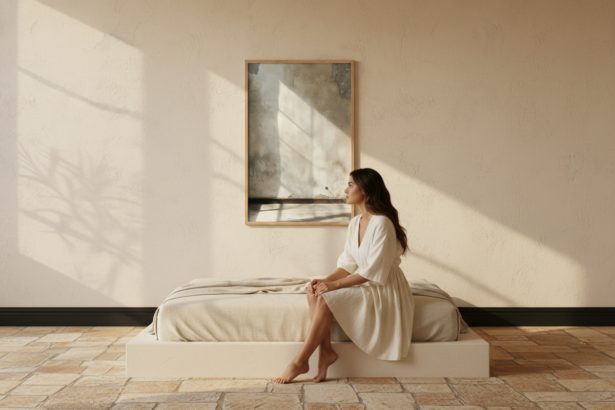
The Woodwork — a single calm image above a loaded piece of furniture
Three mistakes that keep coming back
- Multiplying the wood species. Oak on the floor, walnut on the sideboard, pine on the shelves, then a fourth wood for the frame. Two species in one room is a stance; four is disorder. The frame has to pick up one of those already present.
- Choosing the poster before looking at the wood. That is the wrong way round. The furniture will not change; the poster can.
- Trying to warm up a room that is already warm. Beige walls, honey wood, ecru textiles, then a terracotta poster: nothing contrasts any more and the room turns monotonous. In that precise case, it is a cool neutral — grey stone, shadow, white plaster — that wakes the whole thing up.
FAQ — Beige and wood living room
Which poster colour for a beige living room with light wood furniture?
Stay in the warm neutrals — sand, ivory, clay, plaster — and look for contrast in the material rather than in the colour. A mineral texture over light wood furniture works almost every time. See the Minéral collection.
Do you need a wooden frame when the furniture is already wood?
Yes if the species are alike: an oak frame facing oak furniture creates a continuity that structures the wall. No if the furniture is dark or reddish — in that case a light frame underlines the gap, and the poster without a frame is often the better call.
Which poster above a wooden sideboard?
An image whose width comes close to two thirds of the width of the sideboard, with a constant gap between the furniture and the frame. If the sideboard is loaded with objects, prefer a single calm poster to a composition. See our advice for the living room.
How do you keep the living room from looking too brown?
Bring in a neutral that is cooler or lighter than the wood: stone, limewash, plaster, shadow. Beige and wood on their own quickly turn monochrome; it is the mineral that opens the room back up. See also our take on warm minimalism.
Do rattan and cane count as wood?
Visually yes, but with an extra weave. Facing them, choose smooth surfaces — a frame with a discreet grain and an image without heavy texture — so that two weaves do not fight over the same wall.
See also: Living room wall poster — Oak framed poster — Mediterranean decoration — Minimalist decor — Beige sand wall: the guide



Leave a comment
This site is protected by hCaptcha and the hCaptcha Privacy Policy and Terms of Service apply.