Ochre, colour of the sun: how to use it in your decor
From golden yellow to Siena, ochre is undoubtedly the most sun-drenched color in the Mediterranean palette. A natural pigment among the oldest in the world—used since prehistory in the Lascaux caves to the facades of Provence—it instantly warms up an interior. Here’s how to incorporate ochre into your decor without overdoing it.
Reading time: 6 min
Why ochre warms up a room
Ochre carries the light of the sun and the memory of the earth. In an interior with neutral tones—white, ecru, sand—a touch of ochre is enough to create a feeling of warmth and envelopment. This effect is particularly valuable in north-facing or dimly lit rooms, where natural light is lacking.
Unlike bright yellow or orange, ochre is an earthy color: it doesn’t shout, it radiates. It integrates naturally into a contemporary interior without unsettling it, and ages well—like all natural colors.

A color with Mediterranean roots
Ochre is everywhere in southern architecture: facades of Provence, terracotta from Italy, pigments from Roussillon, sun-gilded walls of Santorini. This is what makes it so natural in Mediterranean-inspired decor—it doesn't impose itself, it belongs.
In the Cassili-home palette, ochre comes in mineral layers, in grazing light on stone, in dunes gilded by the setting sun. Subjects that capture the essence of this color without caricaturing it. To go further: Mediterranean colors that visually enlarge a room.

How to incorporate ochre into your home
No need to repaint an entire wall. Ochre works best in touches—that’s even its strength: a single, well-chosen piece is enough to transform the ambiance of a room.
- A wall poster — the simplest and most reversible way to introduce ochre. It creates a focal point of warmth on a light-colored wall without requiring renovation.
- A textile — a throw, cushion, or ochre linen curtain. Combine it with ecru and sand for softness.
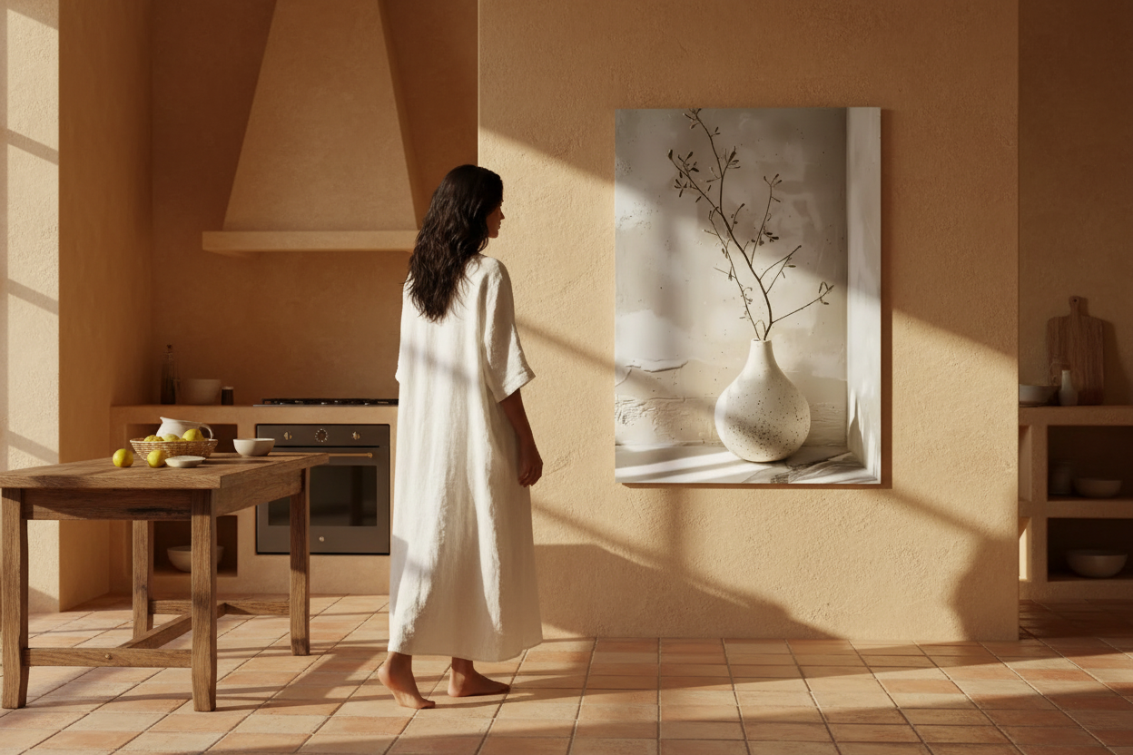
- A ceramic piece — a vase, bowl, or terracotta pot. The material reinforces the natural dimension of the color.
- An accent wall — if you want to go further, a single wall painted in soft ochre is enough. The other walls remain white or ecru.
The best combinations: ochre + ecru + sand for softness, ochre + olive green for Mediterranean balance, ochre + terracotta to intensify warmth.

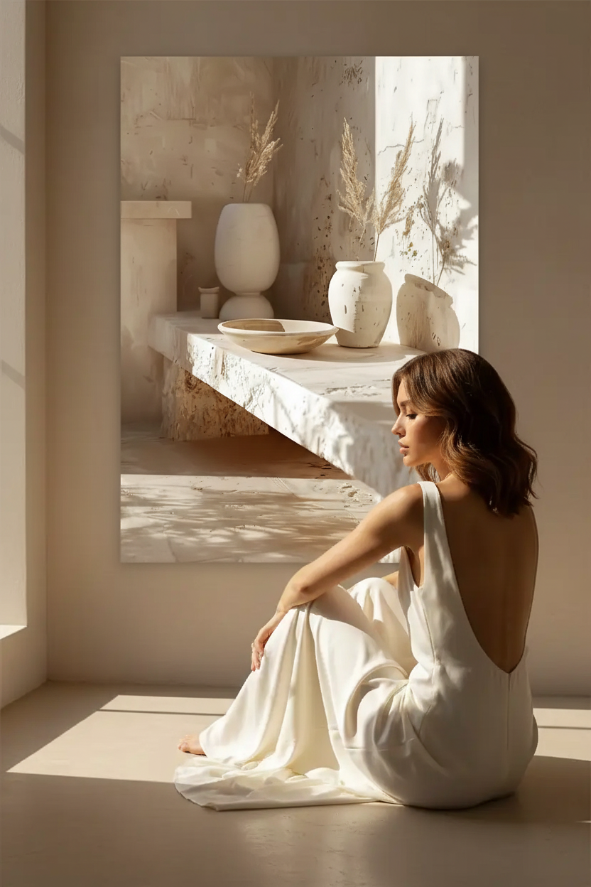
Ochre in wall art: our selections
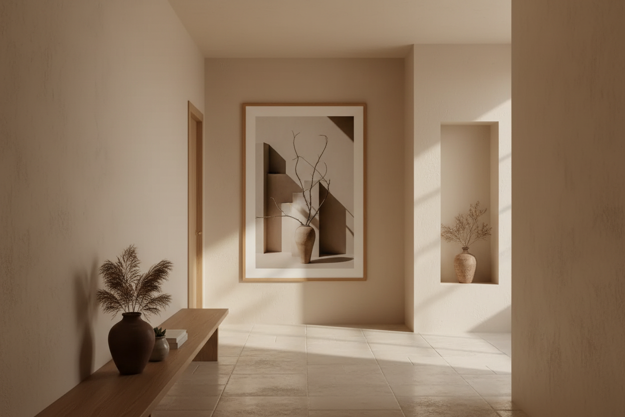
An ochre-toned poster becomes a small focal point of light on a light-colored wall. Alone above a piece of furniture, or integrated into a gallery wall to warm up a more neutral ensemble, it structures the ambiance without dominating it.
Our collections richest in warm tones:
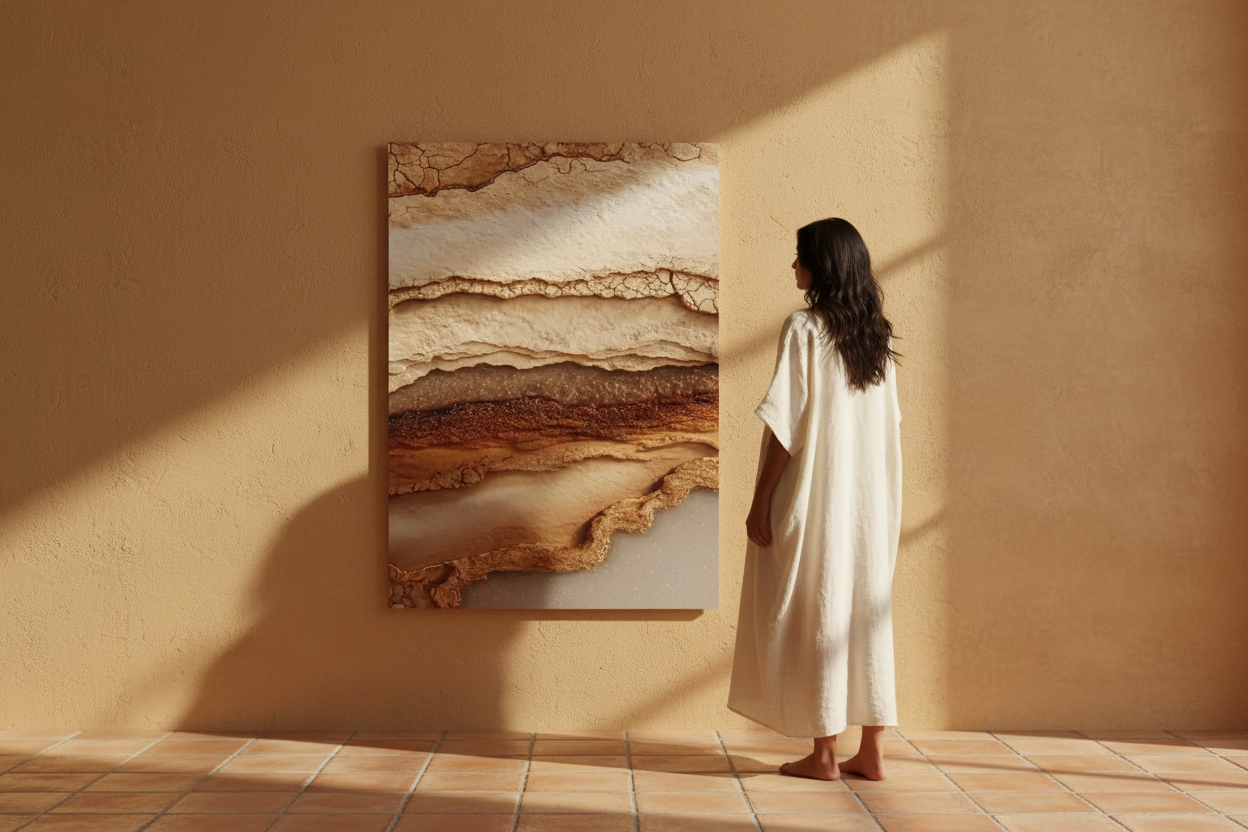
- Mineral Collection — strata, ochres, earths, limestones. The collection richest in natural warm tones.
- Light Collection — grazing light on stone, evening golds, warm reflections.
- Illusion Collection — gilded organic textures, living materials with ochre and gold reflections.
- Nature & Sea Collection — golden sands, dunes, evening light on the coast.
To create a coherent ensemble, use our gallery wall configurator and test associations before ordering.

Room by room: where to use ochre
- Living Room — above the sofa, a large-format ochre poster (A1 or 50x70 cm) creates a warm focal point. Pair it with a terracotta throw and ecru linen cushions.
- Bedroom — as a headboard, ochre brings an enveloping warmth conducive to rest. Prefer soft tones—pale ochre, golden sand—rather than intense ones.
- Entryway — a golden poster in the entryway immediately sets a warm and welcoming atmosphere from the first step.
- Office — ochre stimulates without being aggressive. A warm-toned poster in an office creates an atmosphere conducive to concentration and creativity.
Mistakes to avoid
- Too much ochre everywhere — ochre works in touches. Too many ochre surfaces in the same room create a suffocating feeling. One or two pieces are enough.
- Ochre with pure white — pure white cools ochre and creates a harsh contrast. Prefer ecru or sand as a background.
- Mixing ochre and cold colors — bright blue, cold grey: these associations break the warmth of ochre. Stick to warm, natural tones.
- Too small a format — a small ochre poster on a large wall gets lost. Go for a larger format so that the color truly radiates.
Discover our ochre-toned posters →
FAQ
How to incorporate ochre into your decor without overdoing it?
In touches: a wall poster, a textile, a ceramic. Ochre works better as an accent than as a dominant color. Pair it with ecru and sand for a soft and natural harmony.
What colors to associate with ochre in decoration?
Ecru and sand for softness, olive green for Mediterranean balance, terracotta to intensify warmth. Avoid pure white and cold colors that break the warmth of ochre.
Which Cassili-home collection for ochre-toned posters?
The Mineral collection is the richest in ochre and warm earth tones. The Light collection offers golden and grazing light effects. The Illusion collection features organic textures with gold and ochre reflections.
Is ochre suitable for all rooms?
Yes—ochre adapts to all rooms, but its effect varies. In a living room or entryway, it creates a warm focal point. In a bedroom, prefer pale ochre and soft golden tones for an enveloping atmosphere without excess.
Leave a comment
This site is protected by hCaptcha and the hCaptcha Privacy Policy and Terms of Service apply.