
Mediterranean Colors: Sand, Ivory, Terracotta — How to Pair Them
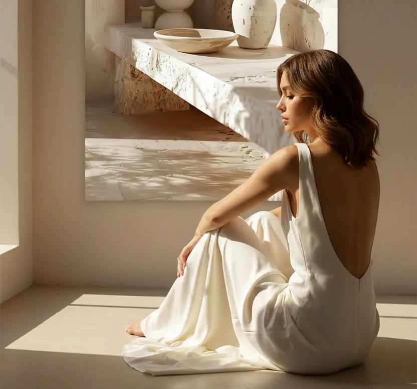
The Mediterranean colors are not a palette in the strict sense—they are materials that have taken on the color of the sun, stone, and earth. The sand of Santorini beaches, the ivory of whitewashed Andalusian facades, the terracotta of Tuscan tiles and Greek pottery. These warm, neutral tones that dominate Southern European interiors have a rare quality: they age well, they harmonize naturally, and they transform any space into a bright refuge. Here's how to combine them effectively.
Reading time: 6 min
Understanding the Mediterranean Palette: Three Tone Families
The Mediterranean palette is organized around three naturally complementary tone families:
Warm Neutrals— sand, ivory, off-white, deep beige—form the base. These are the tones of lime-washed walls, travertine floors, and sun-bleached facades. They reflect light without harshness and create a soothing foundation upon which everything else can rest.
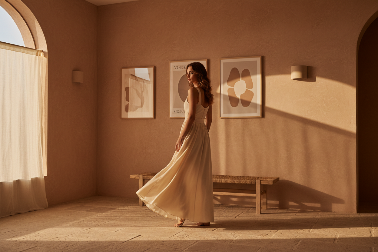
Terracottas— terracotta, ochre, soft rust, rosy brick—bring warmth and depth. These are the tones of pottery, tiles, and terracotta floors. Used as accents, they instantly warm a space without overwhelming it.
Organic Naturals— dusty olive green, Mediterranean midnight blue, stone gray—appear in very subtle touches to anchor the palette in the southern landscape. Discover our Mineral Collection and our Light Collection to find these tones in our wall art.

Sand and Ivory: The Foundation of Any Mediterranean Interior
The sand and ivory are the two pillars of the Mediterranean palette. They are not interchangeable: sand is warmer, more golden, earthier—it evokes beaches and stone. Ivory is cooler, brighter, more refined—it evokes lime wash and marble. When combined, they create a subtle depth that prevents the monotony of an all-white scheme.
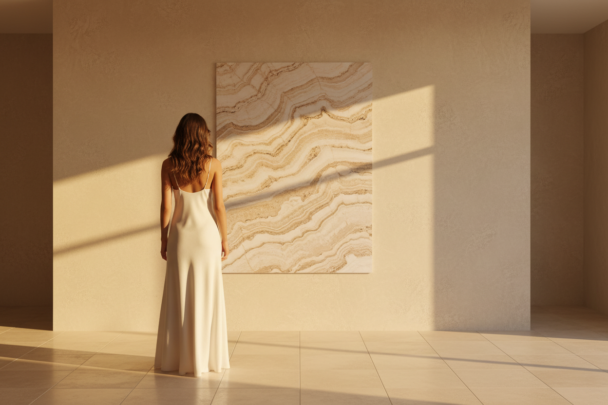
In an interior, sand is ideally applied to large surfaces: walls, floors, sofas. Ivory provides a soft contrast on textiles, lighting fixtures, and frames. This layering of similar but distinct tones is what gives Mediterranean interiors their seemingly simple visual richness. Our Light on Plaster poster perfectly captures this nuance between sand and ivory.
Terracotta: The Accent That Awakens Everything
The terracotta is the signature color of Mediterranean decor. But be careful—terracotta should be used sparingly, not spread everywhere. A cushion, a vase, a flower pot, a candle: these small touches of terracotta are enough to instantly warm a sand and ivory space without saturating it.
The golden rule: terracotta should never exceed 10-15% of a room's visual surface area. Beyond that, it overwhelms other tones and loses its accent power. Below that, it disappears. The right balance creates an immediate evocation of southern homes—Tuscany, Andalusia, Greece. For more insight, our article Natural Materials in Mediterranean Decor explores combinations of materials and tones.

How to Pair Mediterranean Colors with Wall Art
A wall art piece is the most immediate way to introduce or enhance a Mediterranean palette in an interior. A few pairing rules:
- Sand or Ivory Background: choose a poster in the same warm neutral tones—travertine texture, lime wash, low-angle light. The poster blends into the wall and creates subtle depth. Our The Travertine Living Room is ideal for this.
- Off-White Background: you can introduce a slightly more contrasting poster—cast shadow, dark vase, graphic plant. Our The Vase's Shadow creates this perfect soft contrast.
- Terracotta Accent in the Room: choose a poster in ivory or sand tones to balance—never a terracotta poster if you already have terracotta accessories.
Discover all our posters suited for the Mediterranean palette in our Light Collection.

Discover our Mediterranean Wall Art

Mistakes to Avoid with the Mediterranean Palette
- Too Much Terracotta: large-scale terracotta (entire wall, sofa) overwhelms the palette and creates a 70s effect. Keep it as an accent—cushion, vase, candle.
- Pure White Instead of Ivory: pure white disrupts the warmth of the Mediterranean palette. Always opt for off-white, ivory, or a slightly tinted lime white.
- Mixing Too Many Tones: the Mediterranean palette draws its strength from its coherence. Limit yourself to 3-4 tones maximum per room—sand, ivory, terracotta, and an organic natural as a touch.
- Ignoring Materials: Mediterranean colors only work on the right materials. Terracotta on shiny plastic does not evoke the Mediterranean. Linen, travertine, light wood, raw ceramic—materials are as important as tones.
FAQ—Mediterranean Colors in Decor
What are Mediterranean colors in decor?
The Mediterranean colors are organized around three families: warm neutrals (sand, ivory, off-white, beige), terracottas (terracotta, ochre, soft rust), and organic naturals (dusty olive green, midnight blue, stone gray). These tones evoke southern materials—lime wash, travertine, terracotta, linen—and create warm, timeless interiors.
How to incorporate terracotta in a Mediterranean interior?
The terracotta is used as an accent, never as a dominant color. Limit it to 10-15% of the visual surface area: a cushion, a vase, a candle, a pot. Pair it with a sand and ivory base, and choose a wall art piece in warm neutral tones to balance. Our Mineral Collection offers posters perfectly suited for a terracotta interior.
What wall art to choose for a Mediterranean palette?
For a sand and ivory Mediterranean palette, choose posters in the same warm neutral tones—mineral textures, low-angle light, natural materials. Our Light on Plaster and our The Travertine Living Room are the signature posters for this palette.
Can I mix sand, ivory, and terracotta in the same room?
Yes—it's even the ideal combination for Mediterranean decor. Sand and ivory form the base (walls, floor, large textiles), terracotta comes in as an accent (accessories, cushions). Limit yourself to these 3 main tones and add a touch of olive green or light wood to anchor the palette in the southern landscape.
Discover the ideal poster for every room: living room, bedroom, entryway, and bathroom.
→ Mineral Collection— travertine, plaster, stone, and sand
→ Light Collection— low-angle light, golden reflections
→ Light on Plaster— the signature sand and ivory poster
→ The Travertine Living Room— Mediterranean warmth


Leave a comment
This site is protected by hCaptcha and the hCaptcha Privacy Policy and Terms of Service apply.