Beige Wall Art — Why Neutral Prints Are Dominating Home Decor
Beige has had a remarkable rehabilitation. Once dismissed as boring or safe, beige — in all its warm, nuanced variations — has become the defining color of sophisticated contemporary interiors. And beige wall art has followed, moving from background choice to intentional design statement.

Why beige works so well on walls
Beige is not a single color — it’s a family of warm neutrals that includes sand, ivory, warm white, cream, and pale terracotta. What unites them is warmth: they all contain yellow or red undertones that make a room feel inviting rather than cold.
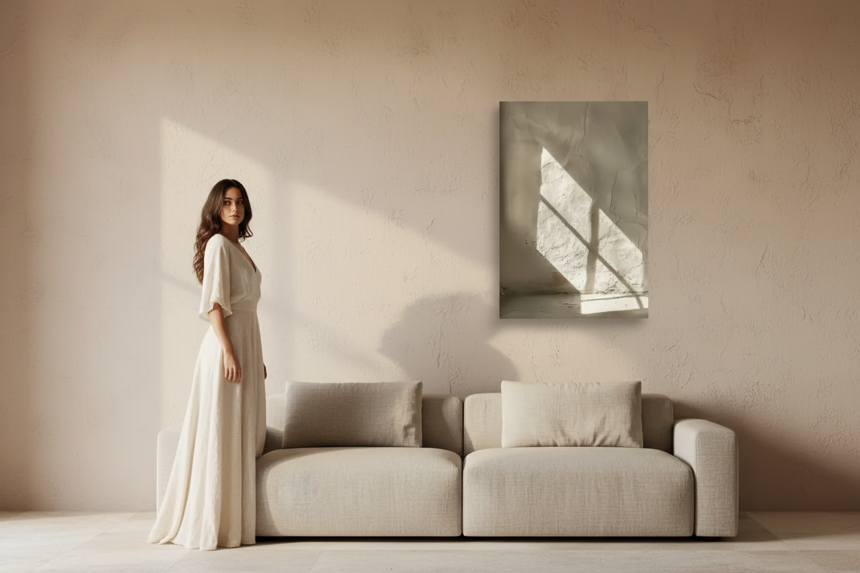
On a wall, beige prints do something that bolder colors can’t: they add visual interest without competing with the rest of the room. Explore our mineral collection for the most refined beige and sand compositions — stone textures, shadow studies, and enduit details in the full warm neutral range. L’Écriture du Sable is one of our most quietly compelling beige prints.

The range within beige wall art
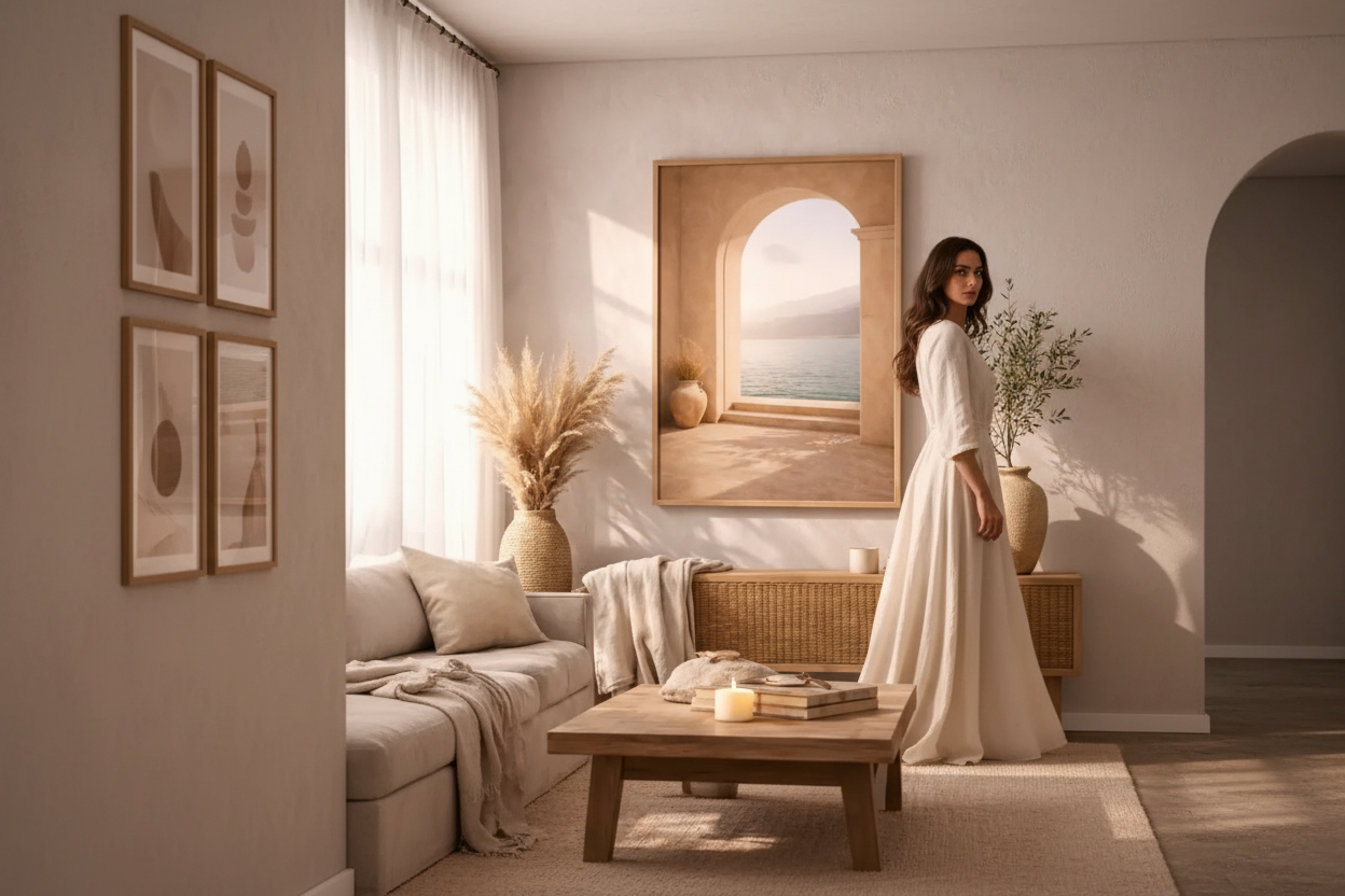
The best beige wall art isn’t flat or monotone — it has depth and variation within the neutral range. A travertine-inspired print with its subtle veining, a Mediterranean arch bathed in warm afternoon light, or a linen-textured botanical study — these are all technically “beige” prints, but each has its own character and presence.
The key is to look for prints where the neutral palette is doing real compositional work — where shadows and light create form, where texture adds interest. Pierre de Sable is a perfect example: a mineral beige composition with subtle texture and depth. Browse our architecture collection for beige prints with strong architectural structure.

Pairing beige prints in a room
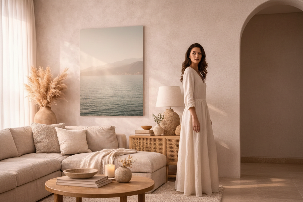
Beige wall art pairs naturally with linen and cotton textiles, natural wood furniture, ceramic objects, and rattan or wicker elements. It suits both warm white and off-white walls equally well. For walls painted in stronger colors — terracotta, sage, warm gray — beige prints act as a grounding element, a visual breath.
For a bedroom, Tronc Blanchi — an ivory and sand nature composition — brings a serene, organic quality above a headboard. Complement with pieces from our vegetal collection for a cohesive botanical mood.
Single statement or gallery collection?
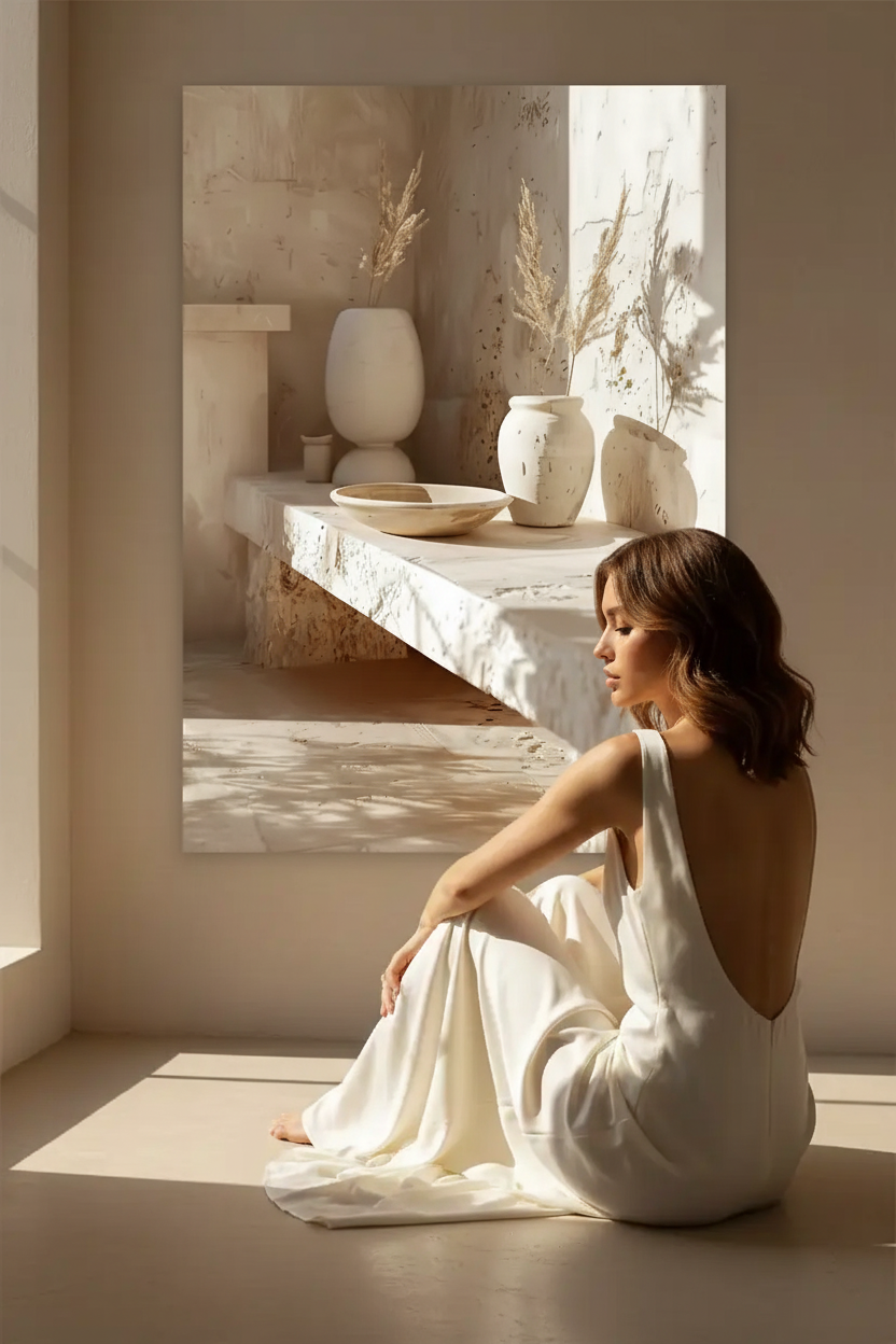
A single large beige print (A1, 50×70 cm) can anchor a room on its own. A curated collection of three to five beige prints in varying sizes creates a gallery wall that rewards close looking. The consistency of palette makes the collection feel intentional; the variety of subjects keeps it interesting. For a figurative touch within the beige palette, L’Éveil de l’Argile — a sand and ivory face composition — adds a quiet human presence without breaking the neutral mood. Explore our lumière collection for light and shadow beige prints.
The mistakes to avoid
- Choosing a print that’s too light for the wall — a very pale beige print on a white wall can disappear. Make sure there’s enough tonal contrast between the print and the wall.
- Mixing warm and cool neutrals — warm beige prints clash with cool gray or blue-white walls. Always match the temperature: warm print with warm wall.
- Choosing a format that’s too small — in a neutral interior, a small beige print can look timid. Go for at least 40×50 cm.
- Over-framing — a heavy dark frame undermines the lightness of a beige print. Choose a thin natural oak frame or go unframed.
Shop beige and neutral wall art prints →

FAQ — Beige Wall Art
Is beige wall art too safe or boring?
Not if you choose the right print. The best beige wall art uses the full range of warm neutrals — sand, ivory, ochre, warm white — to build compositions with real depth and character. A flat beige print is forgettable; a print that uses light, shadow, and texture within the neutral palette is something you’ll want to look at every day.
What wall colors work best with beige wall art?
Warm white, ivory, and off-white walls are the most natural pairing — they let the print’s warm tones breathe without competing. Warm plaster tones (sand, pale terracotta) also work beautifully. Avoid cool-toned walls (pure white, gray, blue-white) which will make warm beige prints look slightly yellow or muddy.
What size beige print works best in a living room?
For a standard living room above a sofa, A1 (59×84 cm) or 50×70 cm is the most effective size. In a neutral interior, one large beige print is almost always more impactful than a gallery wall of smaller prints. If you prefer a gallery wall, limit it to three prints in the same tonal family and keep the spacing generous.
Can I mix different beige prints in the same room?
Yes — mixing beige prints is one of the most effective ways to create a layered, curated interior. Vary the subject matter (architectural, botanical, figurative, mineral) while keeping the palette strictly consistent. All prints should share the same warm neutral temperature — no cool grays or blue-whites in the mix.
Dejar un comentario
Este sitio está protegido por hCaptcha y se aplican la Política de privacidad de hCaptcha y los Términos del servicio.